Time series & comparisons
Time series with a growth-rate fit
Section titled “Time series with a growth-rate fit”energy.plasma.plot.timeseries(logy=True, fit=(0.0, 2.0))Overlays an exponential fit on a window of the series and reports the rate in
result.fit_results. See Diagnostics for
the damping-rate variant (fit the envelope of an oscillating signal instead).
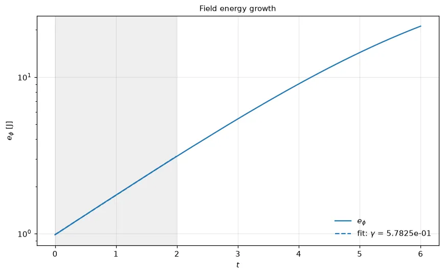
The data behind this plot: energy.plasma.data.timeseries(other_run_energy) returns the validated list of series; the fit is .plasma.analysis.growth_rate() (see Selecting data).
The same plot with Plotly
The same call with backend="plotly": an interactive figure with the same data, fits and
labels (see Interactive plots with Plotly).
energy.plasma.plot.timeseries(logy=True, fit=(0.0, 2.0), backend="plotly")Loading interactive chart…
Several series in one axes
Section titled “Several series in one axes”energy.plasma.plot.timeseries(other_run_energy, logy=True)Passing further arrays plots them together; if they come from different runs
(different attrs["run_name"]), each line is labeled by its run.
Several plots in one figure
Section titled “Several plots in one figure”plasma_plots.figure(nrows, ncols) makes a figure of panels; every plot method that takes
ax= draws into one of them. Here the growing energy with its fit above, and the relative drift
of the total energy below:
import plasma_plots
with plasma_plots.figure(2, 1, sharex=True) as fig:    energy.plasma.plot.timeseries(fit=(0.0, 2.0), ax=fig[0])    total.plasma.analysis.drift().plasma.plot.timeseries(logy=False, ax=fig[1])fig.save("energies.png")fig.results[0].fit_results[0].rate  # each panel's result, with its fits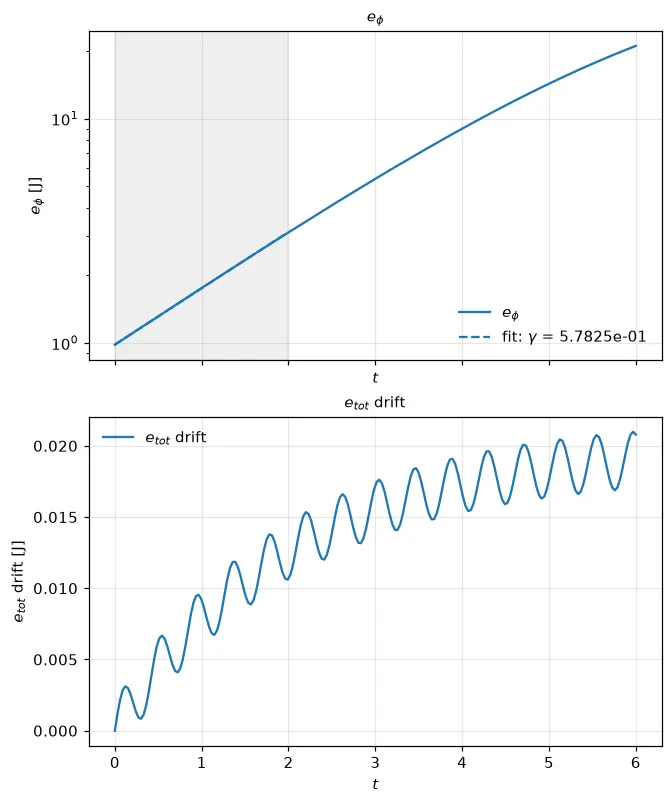
Panels keep their own colorbars and legends; sharex/sharey share the axes (and, in Plotly,
their zoom), and title= goes above all panels. Panels left empty are hidden.
The same plot with Plotly
backend="plotly" finishes the figure as one interactive Plotly figure (see
Interactive plots with Plotly); the plots inside the block draw
into their panels as before:
with plasma_plots.figure(2, 1, sharex=True, backend="plotly") as fig: energy.plasma.plot.timeseries(fit=(0.0, 2.0), ax=fig[0]) total.plasma.analysis.drift().plasma.plot.timeseries(logy=False, ax=fig[1])fig.save("energies.html")Loading interactive chart…
Exact and expected curves
Section titled “Exact and expected curves”reference draws exact or expected curves over the series, dashed and black:
a function of t, an array on the same times, a (t, values) pair, or a dict
of labels to these. A label starting with _ stays out of the legend. For a
damped Langmuir wave, whose k = 1 amplitude comes from
project_mode,
against the exact envelope:
amplitude = e1.plasma.analysis.project_mode(dim="eta1", number=1)amplitude.plasma.plot.timeseries( logy=False, reference={ "±0.1 e^(-γt)": lambda t: 0.1 * np.exp(-gamma * t), "_lower": lambda t: -0.1 * np.exp(-gamma * t), },)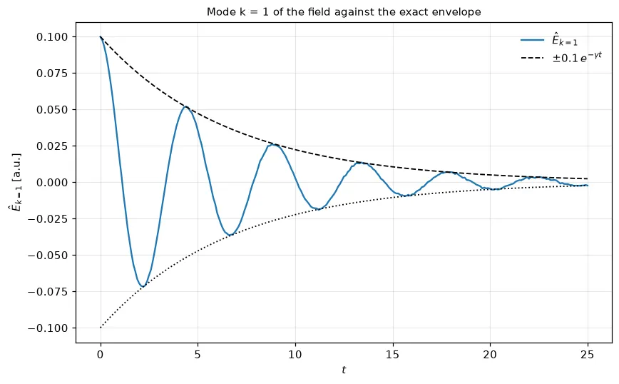
Measured against theory
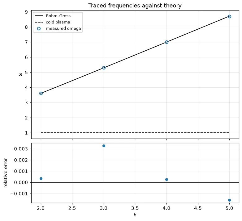
Section titled “Measured against theory”against_theory plots measured values over a parameter against a theory
curve, with their relative error in a second panel. The measured values can be
a 1-D array over the parameter, such as the frequencies from
trace_branch over k or
growth rates over mode numbers. They can also be an (x, y) pair, or a dict of
several runs or methods. The theory can be one function or a dict of several:
traced = spectrum.plasma.analysis.trace_branch(bohm_gross, k_range=(1.5, 5.5))traced.omega.plasma.plot.against_theory(    {"Bohm-Gross": bohm_gross, "cold plasma": lambda k: 1 + 0 * k})
from plasma_plots.plotting import plot_measured_vs_theory
plot_measured_vs_theory(    {"run A": rates_a, "run B": (m, rates_b)},    theory,    logx=True,    show_error=False,)
The error panel compares every measured series with the first theory function.
Comparing two runs directly
Section titled “Comparing two runs directly”field.plasma.plot.compare(reference_field, mode="difference")field.plasma.plot.compare(reference_field, mode="ratio")Aligns the two arrays and plots their difference or ratio as a 1-D lineout — useful for a convergence study or comparing a run against a reference.
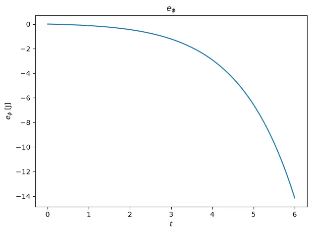
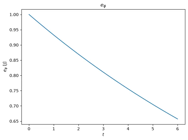
The data behind this plot: field.plasma.data.compare(reference_field, mode="ratio") returns the aligned difference or ratio as a 1-D array (see Selecting data).
The same plot with Plotly
The same call with backend="plotly": an interactive figure with the same data, fits and
labels (see Interactive plots with Plotly).
field.plasma.plot.compare(reference_field, mode="ratio", backend="plotly")Loading interactive chart…