Particles & distributions
Phase-space slices
Section titled “Phase-space slices”A binned distribution such as kinetic_ions/e1_v1_density/f is just another
labeled array, so every field plot
works on it directly:
distribution.plasma.plot.slice(x="eta1", y="v1", t=-1)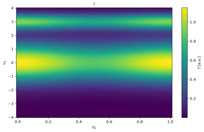
The data behind this plot: distribution.plasma.data.slice(x="eta1", y="v1", t=-1) returns the selected phase-space slice, e.g. for its maximum or a cut through it (see Selecting data).
The same plot with Plotly
The same call with backend="plotly": an interactive figure with the same data, fits and
labels (see Interactive plots with Plotly).
distribution.plasma.plot.slice(x="eta1", y="v1", t=-1, backend="plotly")Loading interactive chart…
Velocity moments
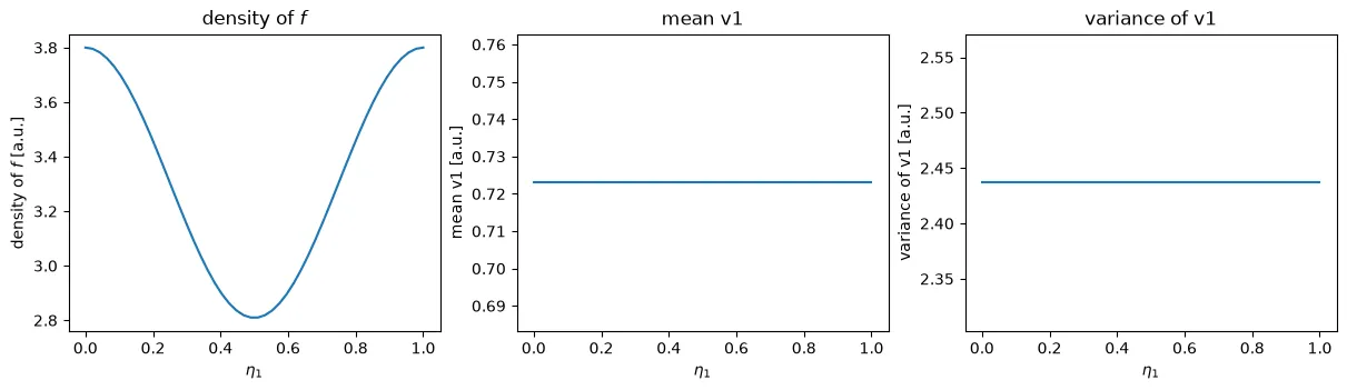
Section titled “Velocity moments”moments = distribution.plasma.analysis.velocity_moments()Returns an xarray.Dataset with density (the zeroth moment), mean_<dim>
and variance_<dim> for each integrated velocity dimension — functions of
the remaining dimensions (e.g. (t, eta1) for an e1_v1 product):
Spatial averaging
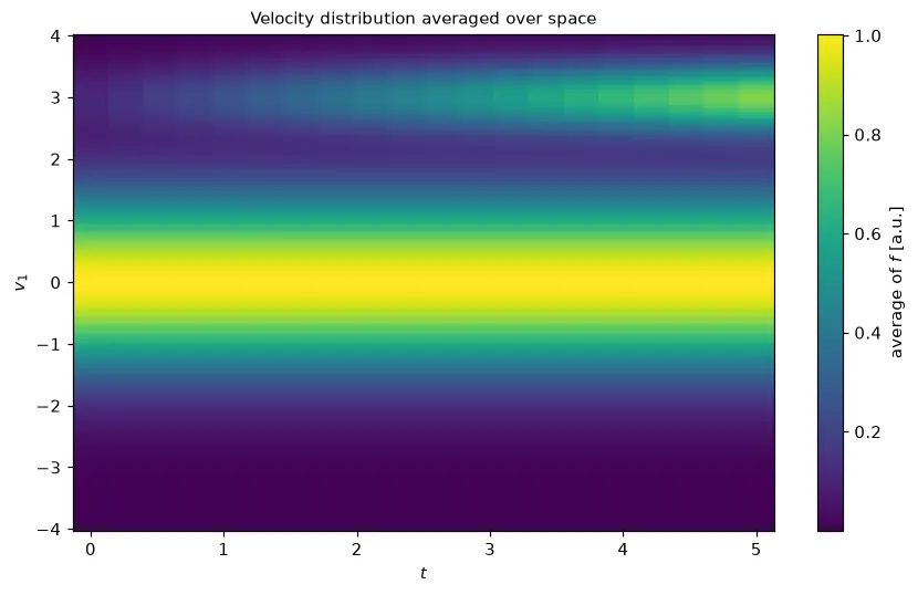
Section titled “Spatial averaging”distribution.plasma.analysis.spatial_average()Averages over the logical space dimensions, e.g. turning f(t, eta1, v1) into
f(t, v1) — plot the result like any other 2-D field to see the velocity
distribution evolve over a run:
Marker trajectories
Section titled “Marker trajectories”markers.plasma.plot.trajectories(max_markers=200)Plots 3-D orbits for kinetic marker output. Works directly on the
xarray.Dataset of an orbits product (one (t, marker) variable per saved
quantity: x, y, z, v1, v2, v3, weight, …), or on a single
(t, marker, quantity) DataArray.
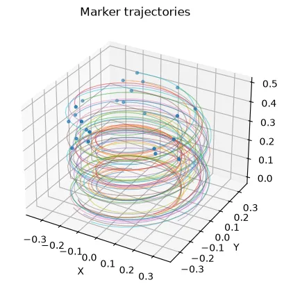
The data behind this plot: markers.plasma.data.trajectories(max_markers=50) returns the marker subset as a Dataset with one (t, marker) variable per quantity (see Selecting data).
The same plot with Plotly
The same call with backend="plotly": an interactive figure with the same data, fits and
labels (see Interactive plots with Plotly).
markers.plasma.plot.trajectories(max_markers=200, backend="plotly")Loading interactive chart…
Orbit classification
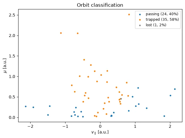
Section titled “Orbit classification”# per marker: 0 passing, 1 trapped, -1 lostcodes = orbits.plasma.analysis.classify_orbits()# initial v_par against mu, colored by classorbits.plasma.plot.orbit_classification()# the canonical-momentum diagramorbits.plasma.plot.orbit_classification(x="p_phi")For guiding-center orbits (Particles5D or Particles5Dvperp), classify_orbits
uses Struphy’s criteria. A marker is trapped if its parallel velocity v_par
ever reverses sign. It is lost if all its saved quantities are zero at some
time, which is how Struphy stores a marker that has left the domain.
The plot scatters each marker’s initial phase-space position. Its default
plane, v_par against mu (or v_perp), shows the trapped cone directly:
markers with a small |v_par| for their mu bounce. The legend gives each
class’s count and fraction. x="p_phi" gives the canonical-momentum view when
p_phi was saved (Struphy fills it only with save_constants_of_motion).
Orbits in the poloidal plane
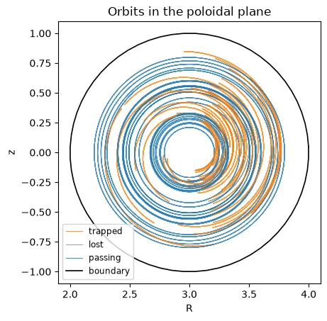
Section titled “Orbits in the poloidal plane”orbits.plasma.plot.poloidal(boundary=field) # R = sqrt(x² + y²) against zorbits.plasma.plot.quantities(markers=4) # v_par and the drift of mu over timepoloidal() projects each orbit onto the poloidal plane, colored as passing,
trapped or lost (see orbit classification).
Passing orbits circle the magnetic axis and trapped ones trace bananas.
Samples after a marker leaves the domain are dropped. boundary is any field
whose outer surface is drawn as the domain boundary.
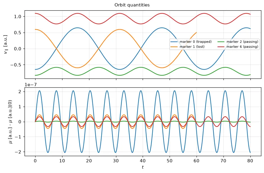
quantities() shows saved quantities over time for a few markers, spread over
the classes. By default these are v_par, whose sign reversals are the bounces
of trapped markers, and the change of the magnetic moment mu since t = 0.
mu is an invariant of guiding-center motion, so its drift measures the
pusher’s accuracy.
orbit_grid() draws one small poloidal panel per marker, with shared axes, so
individual orbits (bananas, passing, lost) can be compared side by side.
markers is a number, spread over the classes, or a list of indices:
orbits.plasma.plot.orbit_grid(markers=8, ncols=4, boundary=field)orbits.plasma.plot.orbit_grid(markers=[3, 17, 42])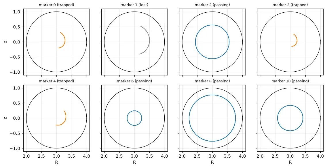
Invariants and bounce periods
Section titled “Invariants and bounce periods”orbit_invariants() computes the invariants that the saved quantities allow,
over (t, marker):
- the
speedfromv1,v2,v3 - for guiding centers, the
energy½ v_par² + μ |B|and thepitchv_par / sqrt(2 × energy), givenabsB: a function ofx, y, z, such as a wrapper around the equilibrium’sabsB0mapped to Cartesian points
Samples after a marker leaves the domain are NaN. The drift of the invariants measures the pusher’s accuracy:
invariants = orbits.plasma.analysis.orbit_invariants(absB=absB_xyz)drift = abs(invariants.energy / invariants.energy.isel(t=0) - 1).max("marker")drift.plasma.plot.timeseries()bounce_period() gives each trapped marker’s bounce period: twice the mean
time between sign changes of v_par, interpolated between samples. It is NaN
for passing markers and for markers with fewer than two reversals:
periods = orbits.plasma.analysis.bounce_period()codes = orbits.plasma.analysis.classify_orbits()periods.where(codes == 1).plot.hist()δf weights and noise
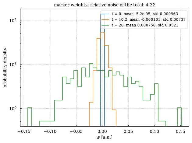
Section titled “δf weights and noise”orbits.plasma.plot.weight_histogram(t=[0, 10.0, -1])stats = orbits.plasma.analysis.weight_statistics()stats.noise.plasma.plot.timeseries(logy=False)A δf scheme starts with weights near zero that spread as the perturbation grows; the tail of
large weights is where the noise of the estimate comes from. weight_histogram draws the
distribution of the weights (Struphy’s weight quantity) at one or several times, with the mean
and spread of each in the legend. weight_statistics returns, over t, the mean, std,
min, max and total of the weights, the relative statistical error of the total that random
marker positions give, noise = √(Σw²)/|Σw| (large by construction for δf weights that sum to
nearly nothing; watch the std then), Kish’s effective_markers = (Σw)²/Σw² and the count of
markers still in the domain. Lost markers (every quantity zero) are left out.
Marker density against the physical density
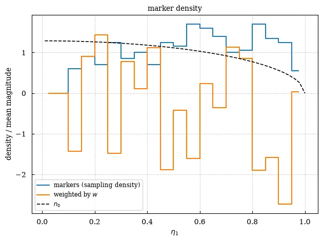
Section titled “Marker density against the physical density”orbits.plasma.plot.marker_density( x="eta1", against=n.isel(eta2=0, eta3=0), t=-1)sampling = orbits.plasma.analysis.marker_density(dims="eta1", bins=32)physical = orbits.plasma.analysis.marker_density( dims="eta1", bins=32, weight="weight")Where the markers are is not what they represent: marker_density bins the markers over
position variables (eta1, or ("x", "y"), …) per unit volume, either counting them (the
sampling density, where the markers were loaded) or weighing them (the density they represent:
the physical density of a full-f run, the perturbation of a δf run). The plot shows both along
one coordinate, normalized to unit mean magnitude so that their shapes compare, together with a
reference profile against= such as the density the code computed or the equilibrium’s. With
importance sampling the two differ by design.
Losses
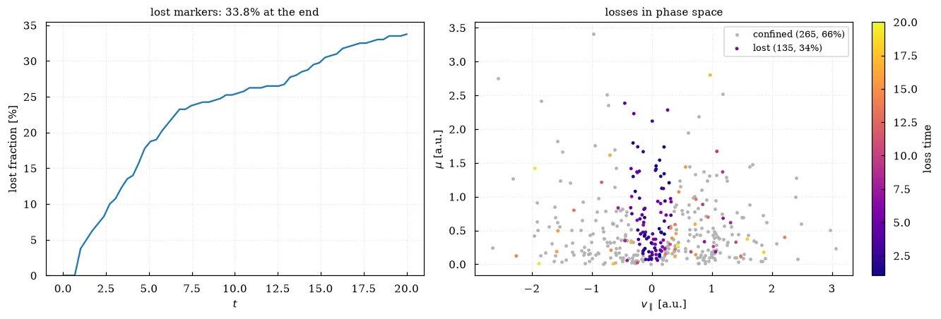
Section titled “Losses”orbits.plasma.plot.lost_fraction() # markers lost, in %, against time# particles, by initial weightorbits.plasma.plot.lost_fraction(weight="weight")orbits.plasma.plot.loss_map() # initial v_par against mu, colored by loss timeorbits.plasma.plot.loss_map(x="energy", y="pitch", absB=absB_xyz)A marker is lost from the first time every saved quantity is zero, which is how Struphy stores
a marker that has left the domain. lost_fraction counts them (or, with weight=, the
particles they represent) over time; loss_map scatters each marker’s initial phase-space
position, confined markers grey, lost ones colored by their loss time, so prompt losses (the
loss cone, unconfined orbits) stand out from slow ones. x and y are variables of the
Dataset, or "energy", "pitch" and "speed" from the
invariants (absB needed). The numbers are in
orbits.plasma.analysis.lost_fraction() and .loss_map() (over marker: the positions,
lost and loss_time).
Marker scatter and particle clouds
Section titled “Marker scatter and particle clouds”markers.plasma.plot.scatter(x="x", y="y", color="density", t=-1)Scatters two position-like variables from any per-marker Dataset (not just
an orbits product — any Dataset with a marker dimension), optionally
colored by a third variable such as a density, weight, or a Lagrangian
tracer a particle carries. Useful for checking a marker loading scheme, or
visualizing an SPH particle cloud:
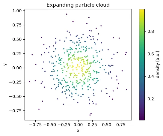
The data behind this plot: markers.plasma.data.scatter(x="x", y="y", color="density") returns the selected Dataset; .to_dataframe() makes it a table (see Selecting data).
The same plot with Plotly
The same call with backend="plotly": an interactive figure with the same data, fits and
labels (see Interactive plots with Plotly).
markers.plasma.plot.scatter( x="x", y="y", color="density", t=-1, backend="plotly")Loading interactive chart…
Markers over a field
Section titled “Markers over a field”scatter() draws a field behind the markers, at the same time
(background=, with its other dimensions selected). The field is drawn in
logical or physical coordinates, whichever the marker positions are.
color_at colors each marker by a variable at another time, e.g. its initial
position, to follow where fluid parcels go:
markers.plasma.plot.scatter( x="x", y="y", color="x", color_at=0, t=-1, background=density.isel(eta3=0), background_options={"cmap": "Blues"},)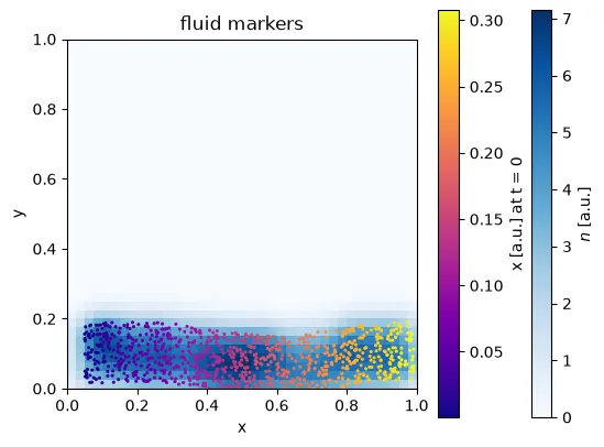
Marker animations
Section titled “Marker animations”animation() moves the markers through time, optionally over a field animated
in sync (drawn at the nearest time of each frame, with fixed color limits).
Markers that leave the domain disappear, and the axes limits stay fixed:
anim = markers.plasma.plot.animation( x="x", y="y", color="x", color_at=0, background=density.isel(eta3=0), background_options={"cmap": "Blues"},)anim.save("dam_break.gif", writer="pillow", fps=8)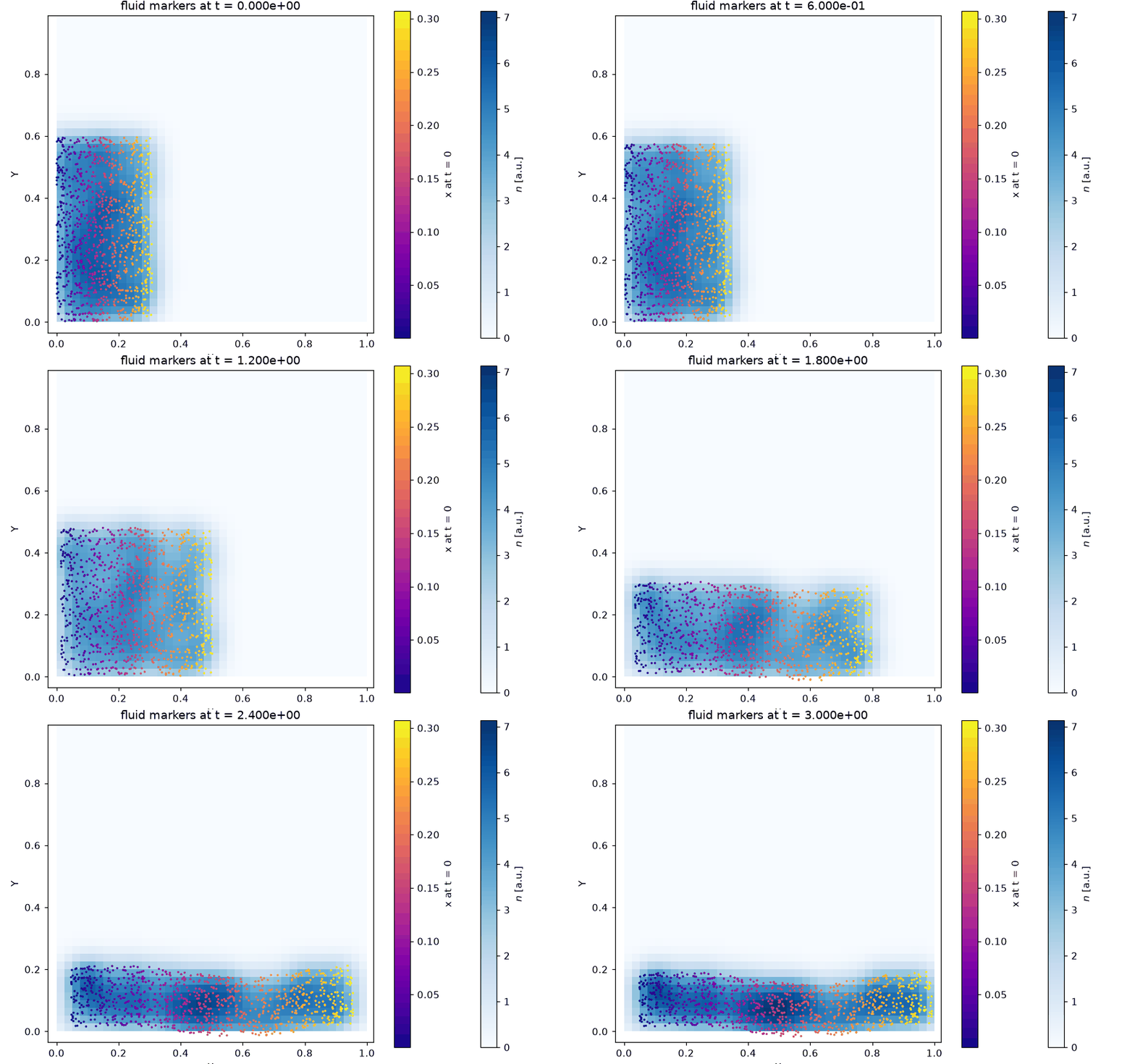
For orbits, a few more options:
- A
backgroundwithout atdimension (e.g. flux-surface contours, withbackground_options={"levels": 6, "fill": False}) is drawn once and stays fixed. trail=60draws each marker’s last 60 samples behind it;paths=Trueits whole path, faint.color="classification"colors the markers as passing, trapped or lost (fromv_par, see orbit classification), with a legend.x="R"is the major radius√(x² + y²), sox="R", y="z"is the poloidal plane.max_frames=80keeps at most 80 evenly spaced frames.
anim = orbits.plasma.plot.animation( x="R", y="z", color="classification", trail=60, paths=True, max_frames=80, background=psi, background_options={"levels": 6, "fill": False, "cmap": "Greys"},)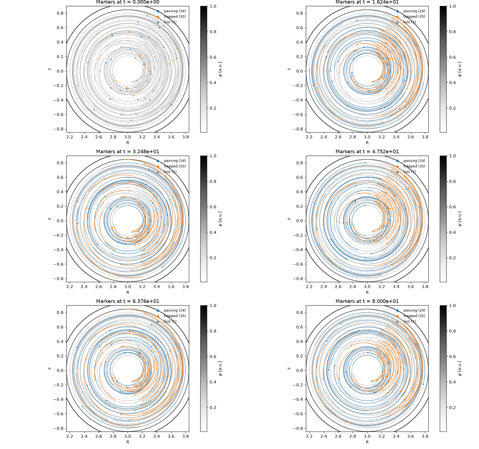
The same plot with Plotly
The same call with backend="plotly": an interactive figure with the same data, fits and
labels (see Interactive plots with Plotly).
orbits.plasma.plot.animation( x="R", y="z", color="classification", trail=60, paths=True, max_frames=80, background=psi, background_options={"levels": 6, "fill": False, "cmap": "Greys"}, backend="plotly",)Loading interactive chart…
Marker paths
Section titled “Marker paths”paths() draws the paths of a few markers in a plane, with a circle where
each starts and a cross where it ends. markers is a number (spread over the
saved markers) or a list of indices. near picks instead the marker starting
closest to each of a list of points. A background field, e.g. the contour
lines of a stream function, shows what the markers should follow:
markers.plasma.plot.paths( near=[(x, 0.25) for x in np.linspace(0.28, 0.46, 6)], background=psi, background_options={"levels": 12, "fill": False, "cmap": "Greys"},)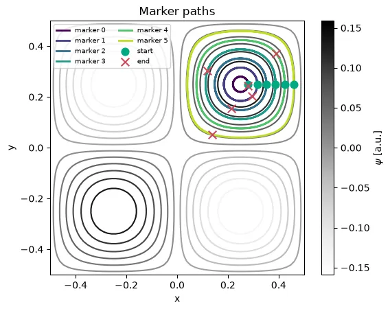
Orbits over a background field
Section titled “Orbits over a background field”field.plasma.plot.overlay_orbits(orbits, x="eta1", y="eta2", t=-1)Draws this field’s 2-D slice with marker paths from an orbits-like Dataset
overlaid — a Poincare-style diagnostic for checking particle confinement or
orbit topology against a background field (e.g. |B| or a flux function in
a poloidal cross-section). orbits needs position variables named x and
y too, matching the field’s chosen axes:
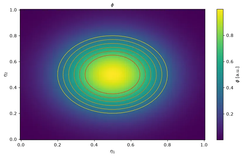
The data behind this plot: field.plasma.data.overlay_orbits(orbits, x="eta1", y="eta2", t=-1) returns the field slice and the orbit subset as a tuple (see Selecting data).
The same plot with Plotly
The same call with backend="plotly": an interactive figure with the same data, fits and
labels (see Interactive plots with Plotly).
field.plasma.plot.overlay_orbits( orbits, x="eta1", y="eta2", t=-1, backend="plotly")Loading interactive chart…