Selecting data
Every plot on array.plasma.plot has a twin on array.plasma.data. The twin
takes the same arguments and does the same selection, but returns the
xarray object the plot would draw instead of a figure. The result keeps the
coordinates (including the physical X, Y, Z), the units and the labels,
so you can work with it directly:
- analyze it: take maxima, means and cuts, or compare two times
- plot it with plain matplotlib, Plotly, HoloViews or any other library
- export it with
.to_dataframe(),.to_netcdf()or.values
# 2-D, with X and Ylast = n.plasma.data.slice(coords="physical", plane="XY", t=-1, eta3=0)# 1-D, along eta1cut = n.plasma.data.lineout(x="eta1", t=-1, eta2=0.3, eta3=0)Selecting by name
Section titled “Selecting by name”Name each dimension you don’t plot, as for every plot:
| Value | Selects |
|---|---|
an integer, e.g. t=0 or t=-1 |
that position: the first, the last |
a float, e.g. t=0.35 |
the nearest coordinate value |
An integer and a float differ: t=0 is the first sample, t=0.0 the one
nearest to time zero.
An unknown name raises an error that lists the array’s dimensions, and a static slice asks you to select one time if you haven’t.
coords="physical" with a plane ("XY", "XZ", "YZ" or "RZ") selects
for a slice in physical space. Struphy’s cell-centered grids leave out the
periodic seam (e.g. θ = 1 ≡ 0), and the physical slice closes it again, so
data.slice and data.view return one more point along a periodic angle than the field has.
The 2-D slice comes back ordered (x, y), the order you asked for. Many
libraries read an array as (row, column), i.e. (y, x), so transpose it for
those (selected.transpose("eta2", "eta1"), or .T).
The data behind each plot
Section titled “The data behind each plot”| Plot | Data | Returns |
|---|---|---|
plot.lineout(...) |
data.lineout(...) |
the 1-D profile |
plot.slice(...) |
data.slice(...) |
the 2-D slice, ordered (x, y) |
plot.panels, viewer, animation, frames |
data.view(...) |
the slice over the whole sweep, e.g. (t, x, y) |
plot.vector(...) |
data.vector(...) |
the selected, strided components |
plot.volume_slices(...) |
data.volume_slices(...) |
the three midplanes, as a dict |
plot.compare(other) |
data.compare(other) |
the aligned difference or ratio |
plot.timeseries(*others) |
data.timeseries(*others) |
the validated list of series |
plot.dispersion(...) |
data.dispersion(...) |
the (omega, k) power |
plot.overlay_orbits(...) |
data.overlay_orbits(...) |
the field slice and the orbit subset |
plot.slices_3d(...) |
data.slices_3d(...) |
the logical cuts |
| every 3-D view | data.grid(...), data.to_vtk(...) |
a PyVista grid, or VTK files for ParaView |
dataset.plot.scatter(...) |
dataset.data.scatter(...) |
the positions and colors per marker |
plot.trajectories(...) |
data.trajectories(...) |
the marker subset |
plot.poincare(...) |
data.poincare(...) |
the punctures of the traced field lines |
plot.critical_points(...) |
data.critical_points(...) |
the O- and X-points of a flux function |
dataset.plot.poincare(), footprint() |
dataset.data.poincare(), footprint() |
the punctures, the exit points of traced lines |
dataset.plot.loss_map(...) |
dataset.data.loss_map(...) |
each marker’s initial position, loss flag and loss time |
The full signatures are in the struphy.data reference.
Analysis on the selection
Section titled “Analysis on the selection”The selection is an ordinary DataArray, so xarray and numpy work on it
directly. For the ring from the
contour-line example:
last = n.plasma.data.slice(coords="physical", plane="XY", t=-1, eta3=0)densest = last.isel(last.argmax(...))  # the densest point, with its X and Yprint(float(densest.X), float(densest.Y))
cut = n.plasma.data.lineout(x="eta1", t=-1, eta2=0.3, eta3=0)radius = 0.1 + 0.9 * cut.eta1  # this mapping's minor radiusinside = radius.where(cut >= 0.2)width = float(inside.max() - inside.min())  # the ring's width along the cut
# (t, eta1, eta2)frames = n.plasma.data.view(coords="physical", plane="XY", eta3=0)peak_over_time = frames.max("t")  # the largest density each point reached
The same selections drawn with plain matplotlib:
fig, (ax_map, ax_cut) = plt.subplots(1, 2)ax_map.contourf(last.X, last.Y, last, levels=12)ax_map.plot(densest.X, densest.Y, "w*")ax_cut.plot(radius, cut)ax_cut.axvspan(float(inside.min()), float(inside.max()), alpha=0.25)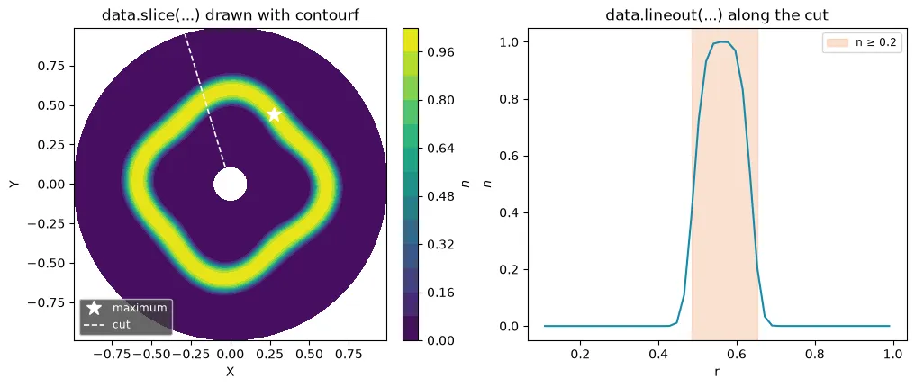
Exports
Section titled “Exports”last.to_dataframe() # a pandas table, one row per point, with X and Ylast.to_netcdf("ring_last.nc") # a self-describing file with all coordinatesnp.save("ring_last.npy", last.values) # the bare numbersn.plasma.data.to_vtk("ring") # one .vts per time and a .pvd for ParaViewOther plotting libraries
Section titled “Other plotting libraries”plasma-plots never depends on another plotting library. The selected data goes to any of
them; for Plotly there is also a shortcut, backend="plotly", which draws every plot as an
interactive Plotly figure (see Interactive plots with Plotly).
Built by hand, a 2-D slice as a Plotly heatmap:
import plotly.express as px
selected = field.plasma.data.slice(x="eta1", y="eta2", t=-1)px.imshow(    selected.transpose("eta2", "eta1"),    x=selected.eta1,    y=selected.eta2,    origin="lower",    color_continuous_scale="viridis",)
Loading interactive chart…