Profiling
Struphy records timing regions (propagators, compiled kernels, linear solves, …) when a run is
started with sim.run(profiling_activated=True), written to profiling_data.h5. Output.profile
reads it back as a scope-profiler ProfilingResults
object, and array.plasma.plot.profile wraps three of scope-profiler’s own plotting functions
directly on it. Install the optional extra to use them:
pip install "plasma-plots[profiling]"Every method here is a thin pass-through: it returns exactly what scope-profiler itself returns
(a (fig, axes) pair for the default matplotlib backend, or a Plotly figure with
backend="plotly"), and forwards every other keyword straight through
(ranks, include/exclude, filepath, …) — see
scope-profiler’s own docs for the full set.
Gantt chart
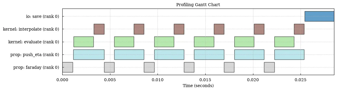
Section titled “Gantt chart”out.plot.profile.gantt()A timeline of every recorded region, one row per rank — the first thing to look at for “where did the time go”:
The same plot with Plotly
out.plot.profile.gantt(backend="plotly")Loading interactive chart…
Flame chart
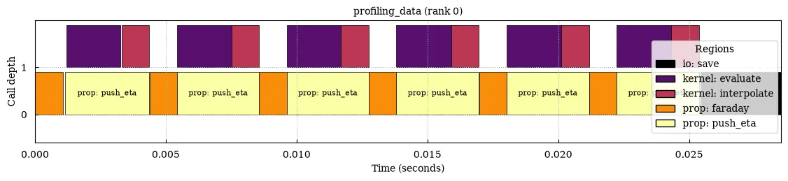
Section titled “Flame chart”out.plot.profile.flame()Reconstructs the call stack from region timings, one column per call, stacked by nesting depth — good for spotting which specific call of a hot region was slow, not just the region as a whole:
Call graph
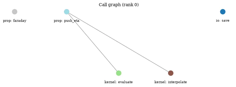
Section titled “Call graph”out.plot.profile.callgraph(compact=True)The explicit call graph — which region calls which — without timings. compact=True collapses
every invocation of a region into one node, so repeated calls (e.g. once per time step) don’t
sprawl the graph; leave it False to see each individual call as its own node: