Field plots
Everything here is a method of array.plasma.plot, where array is a labeled
xarray.DataArray produced by Struphy’s Output.evaluate(...). Full
signatures are in the Plotting reference.
1-D: lineouts
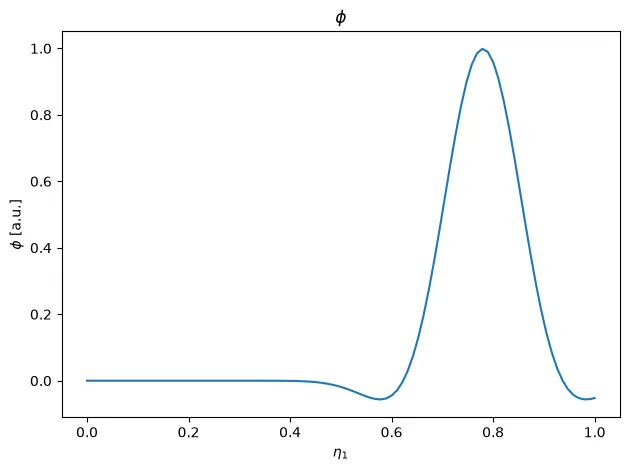
Section titled “1-D: lineouts”field.plasma.plot.lineout(x="eta1", t=-1, eta2=0.5)Selects every dimension except x (via keyword selection) and plots the
remaining 1-D profile.
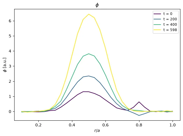
Several profiles in one axes, e.g. at a few times, against the minor radius:
phi.plasma.plot.profiles( x="eta1", at=[0, 100, 200, 299], x_of=lambda eta1: 0.1 + 0.9 * eta1, eta2=0.0, eta3=0.0,)at picks the times (integers are positions, floats nearest values; the
default is four evenly spaced ones), and over names another dimension to
sweep instead of t.
x_of maps the coordinate for one plot. To work in physical units throughout, replace the
coordinate itself: analysis.map_coordinate takes a function of it (or a factor, for a length),
and a new name and units, so that selections and every plot use them:
r_T = T.plasma.analysis.map_coordinate( "eta1", lambda eta1: 0.1 + 0.9 * eta1, name="r", units="m")r_T.plasma.plot.profiles(x="r", at=[0, 20, 40])# a 2 m long intervalT.plasma.analysis.map_coordinate("eta1", 2.0, name="x", units="m")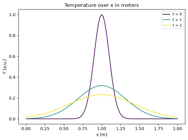
Exact solutions
Section titled “Exact solutions”lineout and profiles take a reference: the exact or expected profile,
drawn dashed in the same color as its profile. It can be a function of the
plotted x and of t (the profile’s time), an (x, y) pair, or a dict of
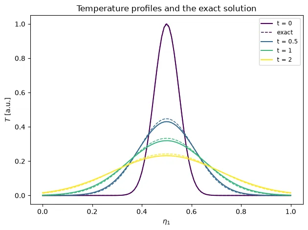
labels to these. For a diffusing temperature against the heat kernel:
def exact(x, t, D=0.01, width=0.05):    s2 = width**2 + 2 * D * t    return width / np.sqrt(s2) * np.exp(-((x - 0.5) ** 2) / (2 * s2))

T.plasma.plot.profiles(    x="eta1", at=[0, 10, 20, 40], reference={"exact": exact})T.plasma.plot.lineout(    x="eta1", t=-1, reference=exact, x_of=lambda eta1: L * eta1)
Here the run’s diffusion coefficient is 10 % too large, so its profiles fall below the exact ones:
line_animation animates a 1-D profile over time with the exact profile of
each frame. The value axis stays fixed over the whole animation:
anim = T.plasma.plot.line_animation(reference={"exact": exact}, step=2)anim.save("heat.gif", writer="pillow")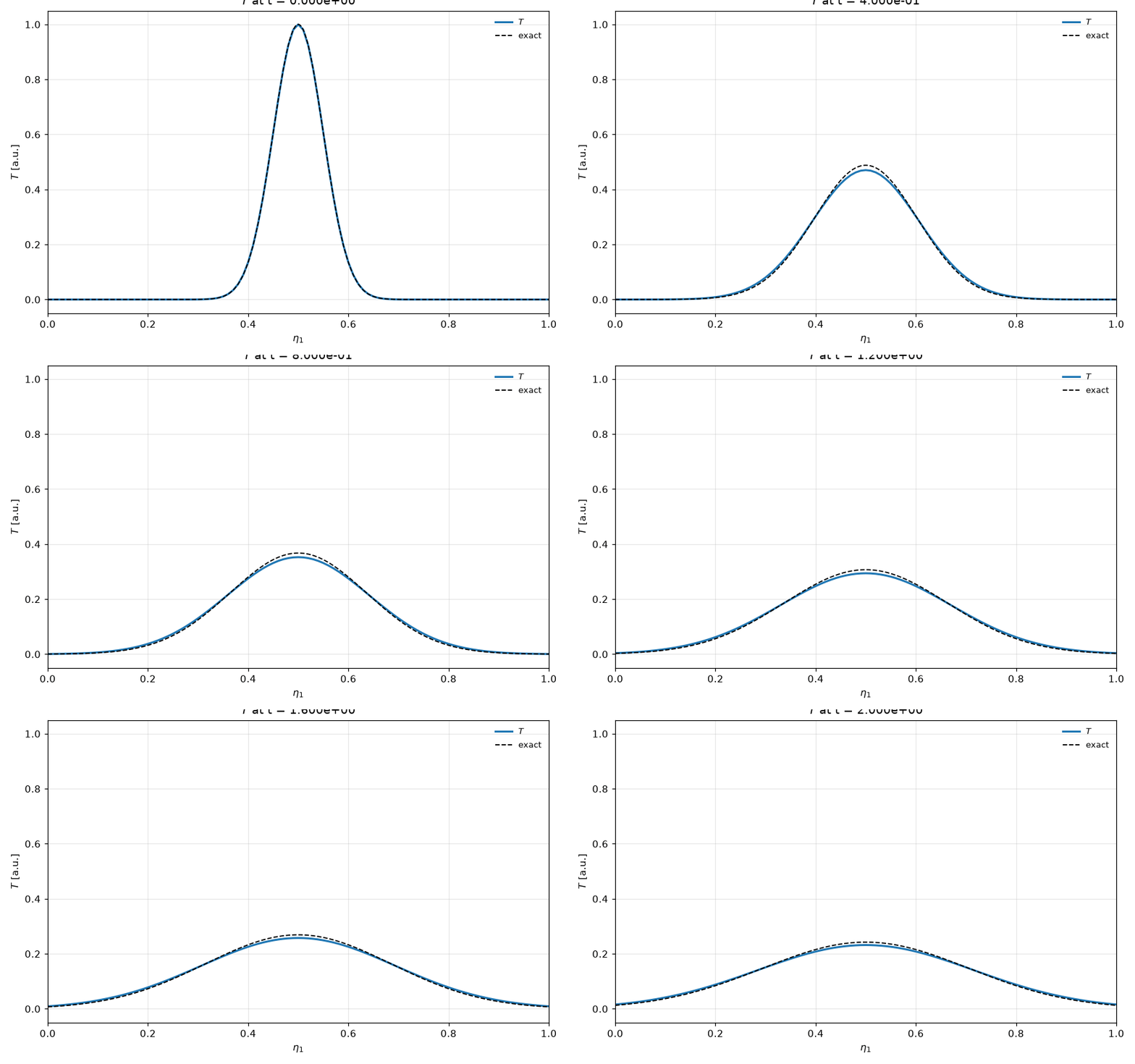
alongside adds panels below the profile that run in sync with it: another profile over the
same sweep (e.g. the density next to the velocity), or time series, drawn whole with a marker at
each frame’s time (a list of series shares one panel; alongside_logy=True puts them on log
axes). Time series may be on another time grid, e.g. scalars saved every step; each frame marks the
nearest time. Here the peak temperature of the run below its profile, against the exact one:
peak = T.max("eta1")anim = T.plasma.plot.line_animation( reference={"exact": exact}, alongside=[[peak, exact_peak]], step=2)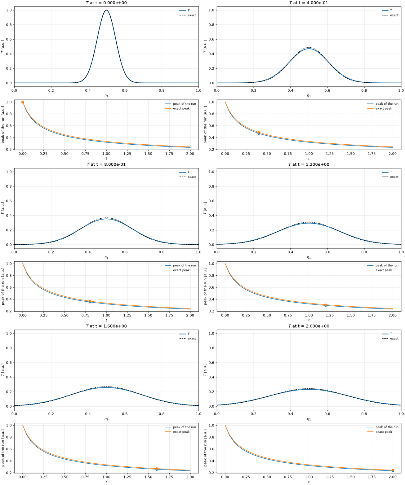
max_frames=100 keeps at most that many evenly spaced frames (the first and the last included),
as for the 2-D animations.
The same plot with Plotly
The same call with backend="plotly": an interactive figure with the same data, fits and
labels (see Interactive plots with Plotly).
T.plasma.plot.line_animation( reference={"exact": exact}, alongside=[[peak, exact_peak]], step=2, backend="plotly",)Loading interactive chart…
For the error itself, see errors against exact solutions.
2-D: slices, panels, viewers, animations
Section titled “2-D: slices, panels, viewers, animations”plot.view(...) configures a reusable 2-D slice — pick the two axes to plot
(x, y) and which dimension to sweep over (sweep, default "t"):
view = field.plasma.plot.view(x="eta1", y="eta2", sweep="t")
view.slice(t=-1) # one snapshotview.panels(nrows=3, ncols=4) # a grid of snapshotsview.viewer() # interactive slider (Jupyter/IPython)view.animation(interval=100) # matplotlib.animation.FuncAnimationview.save_frames("frames/", step=2, prefix="phi")plot.slice(...), plot.panels(...), plot.viewer(...), plot.animation(...)
and plot.frames(...) are shortcuts that build a view and immediately render
it, taking the same keyword arguments as view(...).
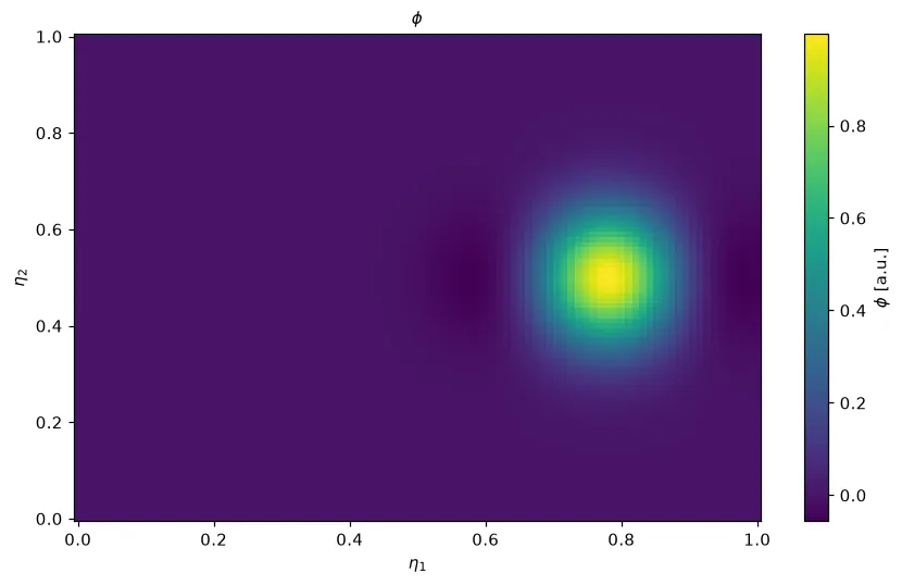
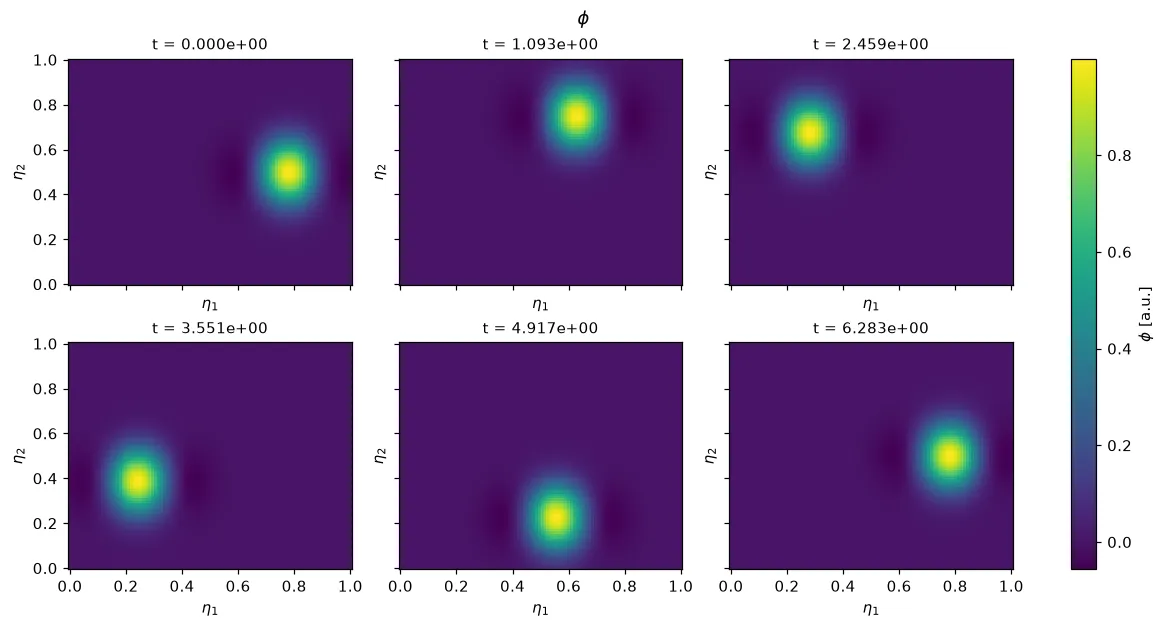
The data behind this plot: field.plasma.data.slice(x="eta1", y="eta2", t=-1) returns the selected 2-D array itself, ordered (x, y), with its coordinates and units, for your own analysis or another plotting library (see Selecting data).
The same plot with Plotly
The same call with backend="plotly": an interactive figure with the same data, fits and
labels (see Interactive plots with Plotly).
view.slice(t=-1, backend="plotly")Loading interactive chart…
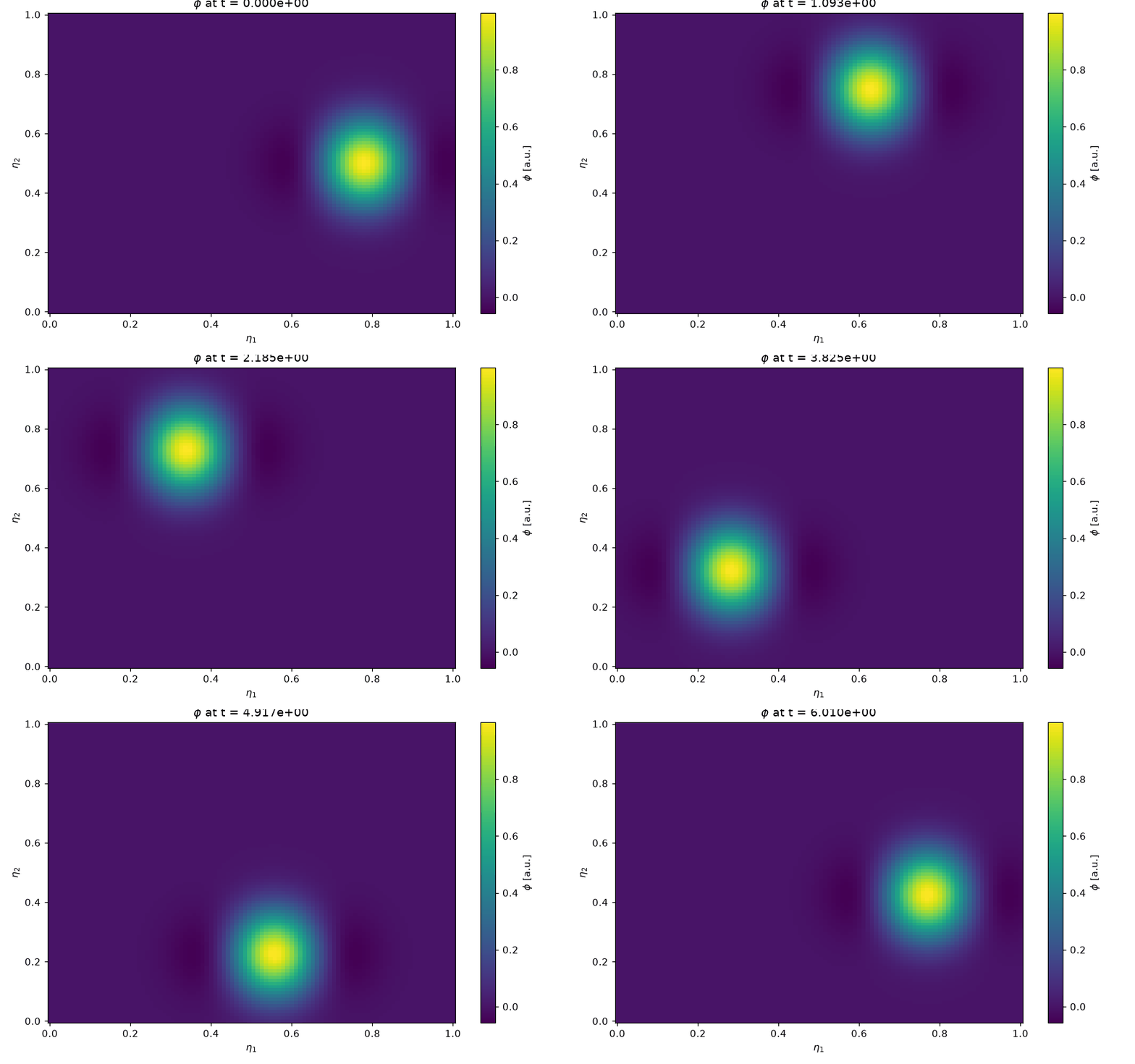
plot.animation(...) returns a matplotlib.animation.FuncAnimation; save it
with anim.save("orbit.gif", writer="pillow"):
Color limits for perturbations
Section titled “Color limits for perturbations”Every slice presentation takes symmetric=True, which centers the color
limits on zero, as a diverging colormap such as "RdBu_r" for a perturbation
needs. robust=True takes the limits from the 1st and 99th percentiles, so a
few extreme values do not wash out the rest. The 3-D views take the same two
options.
view = u.plasma.plot.view( x="eta1", y="eta2", coords="physical", plane="RZ", cmap="RdBu_r", symmetric=True, eta3=0,)view.animation()Physical slices of Struphy’s cell-centered fields close the seam of periodic directions (e.g. θ = 0) automatically, so a poloidal cross-section has no gap.
The axis and color bar labels come from the coordinates’ and the array’s names and units;
xlabel=, ylabel= and colorbar_label= replace them, in every slice presentation:
f_v.plasma.plot.slice( x="t", y="v1", xlabel="time [ms]", ylabel="v", colorbar_label="f(v, t)")Contour lines
Section titled “Contour lines”levels draws contour lines of the field on top of any slice presentation:
slice, panels, viewer, animation and frames. It takes a number of
evenly spaced levels or explicit values. Use it for an interface, flux
surfaces, or the streamlines of a stream function. With fill=False, only the
lines are drawn, colored by cmap.
# the ring's edgesn.plasma.plot.slice(coords="physical", plane="XY", t=-1, eta3=0, levels=[0.2])psi.plasma.plot.slice(levels=12, fill=False, cmap="Greys") # streamlines only# the interface in motionn.plasma.plot.animation(coords="physical", plane="XY", eta3=0, levels=[0.2])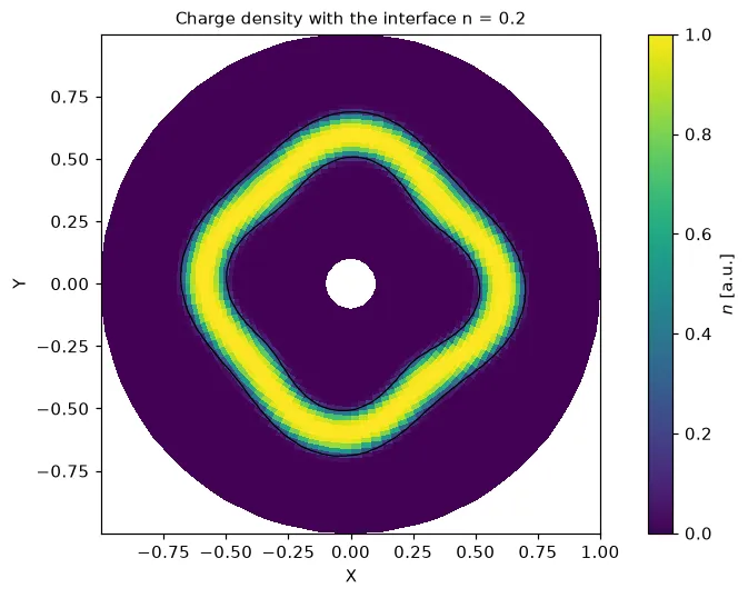
Overlays
Section titled “Overlays”overlays draws more on top of any slice presentation, as a dict:
| Key | Draws |
|---|---|
contours_of |
contour lines of a second field, e.g. the flux function over the current; with contour_levels and contour_color |
boundary=True |
the outline of the grid, e.g. the wall of a mapped domain; with boundary_color |
grid_lines=n |
every n-th grid line, to show the mesh or the mapping |
lines |
labels to (x, y) pairs or functions y(x), e.g. characteristics on a space-time map |
points |
labels to (x, y), e.g. O- and X-points |
Lines and points are white by default, for dark colormaps; set line_color and
point_color otherwise. In an animation, a contours_of field with a t
dimension follows the frames.
Magnetic islands: |B| with the flux surfaces from
flux_function(), and the
O- and X-points:
flux = B.plasma.analysis.flux_function()absB.plasma.plot.slice( coords="physical", plane="XY", eta3=0, cmap="magma", overlays={ "contours_of": flux, "contour_levels": 14, "contour_color": "w", "boundary": True, "points": { "O-point": (np.pi, np.pi), "X-points": ([0, 2 * np.pi], [np.pi, np.pi]), }, },)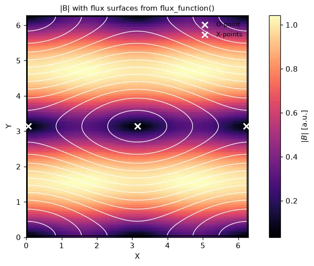
A wave packet on a space-time map (x="eta1", y="t"), with the line
x = x0 + v_g t it should follow:
phi.plasma.plot.slice( x="eta1", y="t", cmap="RdBu_r", symmetric=True, overlays={ "lines": {"group velocity 0.4": lambda x: (x - 0.2) / 0.4}, "line_color": "k", },)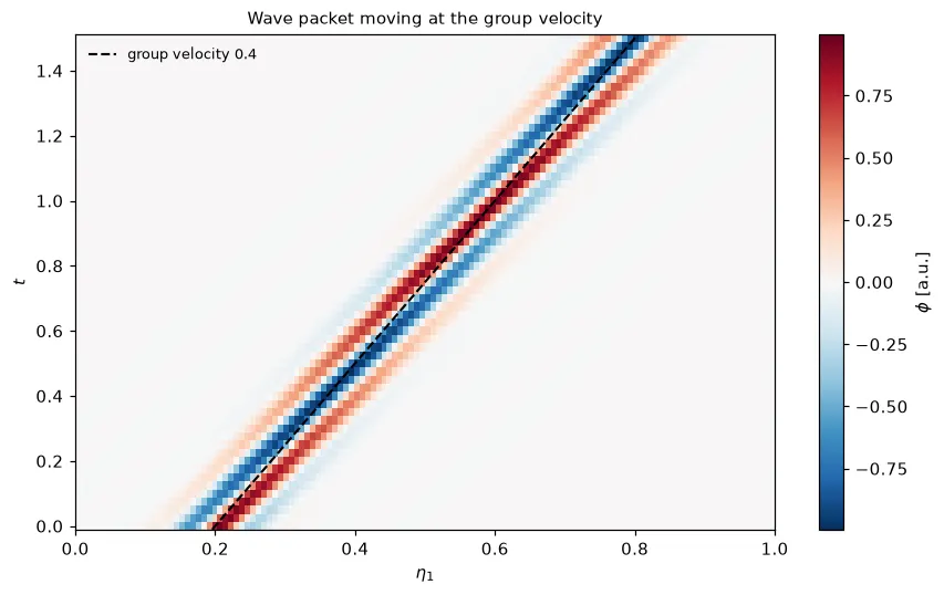
Several fields side by side
Section titled “Several fields side by side”animation(alongside=[...]) animates further fields next to the first one,
frame by frame in sync. Each field keeps its own color limits and color bar.
The selection and options apply to all of them:
omega.plasma.plot.animation( coords="physical", plane="XY", eta3=0, alongside=[density], cmap="RdBu_r", symmetric=True, robust=True,)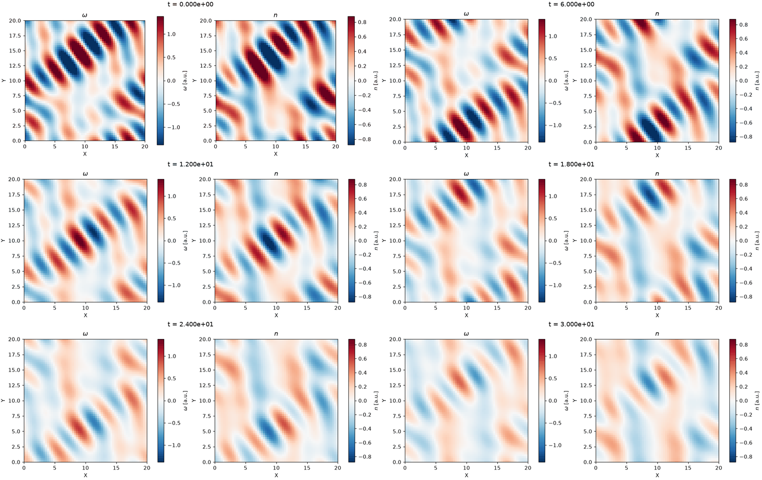
Vector fields
Section titled “Vector fields”b_field.plasma.plot.vector(x="eta1", y="eta2", components=(0, 1), stride=4)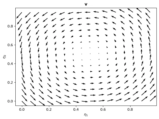
The data behind this plot: b_field.plasma.data.vector(x="eta1", y="eta2", components=(0, 1), stride=4) returns the selected, strided components (see Selecting data).
The same plot with Plotly
The same call with backend="plotly": an interactive figure with the same data, fits and
labels (see Interactive plots with Plotly).
b_field.plasma.plot.vector( x="eta1", y="eta2", components=(0, 1), stride=4, backend="plotly")Loading interactive chart…
3-D scalar volumes
Section titled “3-D scalar volumes”Three orthogonal midpoint slices need nothing extra:
density.plasma.plot.volume_slices()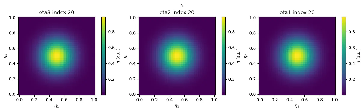
The data behind this plot: density.plasma.data.volume_slices() returns the three planes as a dict keyed by the fixed dimension (see Selecting data).
The same plot with Plotly
The same call with backend="plotly": an interactive figure with the same data, fits and
labels (see Interactive plots with Plotly).
density.plasma.plot.volume_slices(backend="plotly")Loading interactive chart…
A full interactive volume render needs the optional PyVista extra
(pip install "plasma-plots[pyvista]"):
plotter = density.plasma.plot.volume(cmap="viridis", opacity="linear")plotter.show()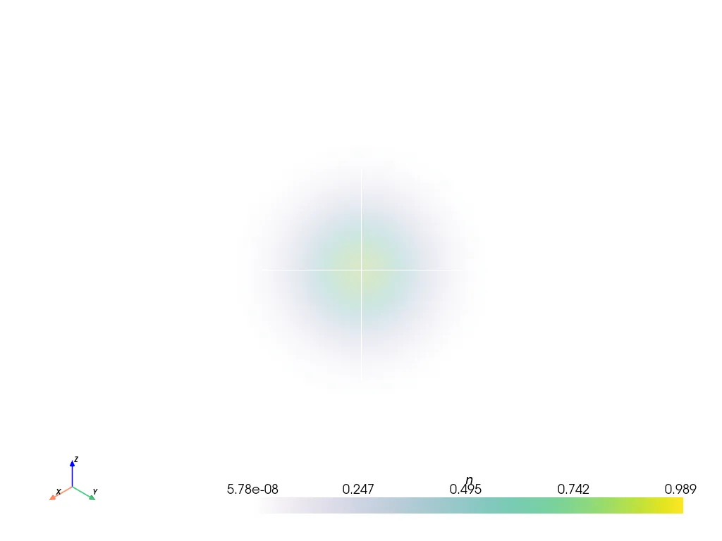
For isosurfaces, cuts through mapped domains, field lines, orbits and movies, in 3-D and 2-D runs, see 3-D views.
Comparing two arrays
Section titled “Comparing two arrays”field.plasma.plot.compare(reference_field, mode="difference")See Time series & comparisons for
compare() figures — it’s a 1-D lineout under the hood, so it fits either
page; we keep the write-up there next to timeseries().