Subfigures and Grid Layouts
Arrange multiple plots side-by-side or in grid layouts using
subfigure_axis() and subfigure().
import mathfrom tikzfigure import TikzFigure, arrowsSide-by-side subfigures
Section titled “Side-by-side subfigures”Create horizontally arranged plots with subfigure_axis():
fig = TikzFigure()
ax1 = fig.subfigure_axis(    xlabel="x",    ylabel="y",    xlim=(0, 360),    ylim=(-1.5, 1.5),    grid=True,    width=0.45,)ax1.add_plot(    func="sin(x)",    label="sin(x)",    color="red",    line_width="1.5pt",)ax1.set_legend(position="north east")
ax2 = fig.subfigure_axis(    xlabel="x",    ylabel="y",    xlim=(0, 360),    ylim=(-1.5, 1.5),    grid=True,    width=0.45,)ax2.add_plot(    func="cos(x)",    label="cos(x)",    color="blue",    line_width="1.5pt",)ax2.set_legend(position="north east")
fig.show()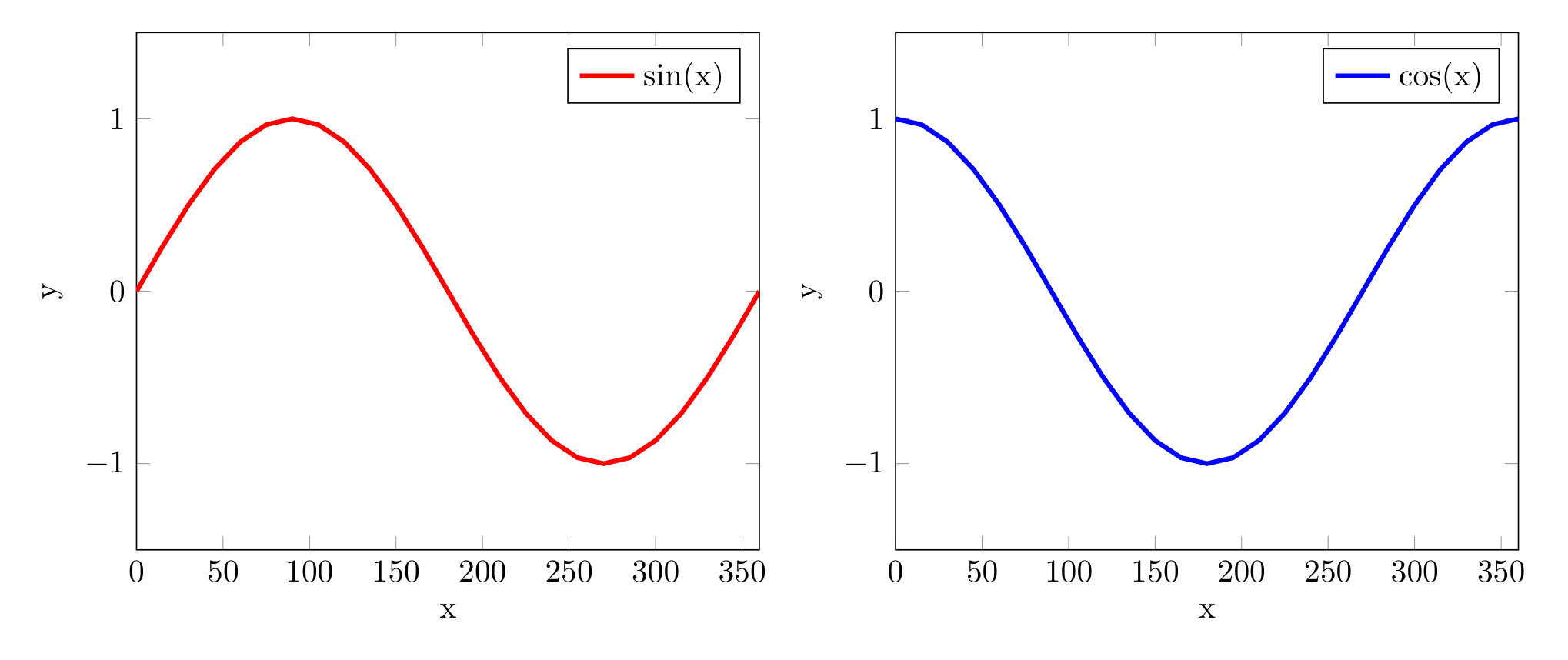
Show Tikz code
print(fig)\begin{tikzpicture} \begin{groupplot}[group style={group size=2 by 1, horizontal sep=1.5cm}] \nextgroupplot[domain=0:360, xlabel=x, ylabel=y, xmin=0, xmax=360, ymin=-1.5, ymax=1.5, grid=major, legend pos=north east] \addplot[color=red, line width=1.5pt] {sin(x)}; \legend{sin(x)}
\nextgroupplot[domain=0:360, xlabel=x, ylabel=y, xmin=0, xmax=360, ymin=-1.5, ymax=1.5, grid=major, legend pos=north east] \addplot[color=blue, line width=1.5pt] {cos(x)}; \legend{cos(x)}
\end{groupplot}\end{tikzpicture}print(fig.generate_standalone())\documentclass[border=10pt]{standalone}\PassOptionsToPackage{dvipsnames,svgnames,x11names}{xcolor}\usepackage{tikz}\usepackage{pgfplots}\pgfplotsset{compat=newest}\usepgfplotslibrary{groupplots}\usetikzlibrary{arrows.meta}\begin{document}\begin{tikzpicture} \begin{groupplot}[group style={group size=2 by 1, horizontal sep=1.5cm}] \nextgroupplot[domain=0:360, xlabel=x, ylabel=y, xmin=0, xmax=360, ymin=-1.5, ymax=1.5, grid=major, legend pos=north east] \addplot[color=red, line width=1.5pt] {sin(x)}; \legend{sin(x)}
\nextgroupplot[domain=0:360, xlabel=x, ylabel=y, xmin=0, xmax=360, ymin=-1.5, ymax=1.5, grid=major, legend pos=north east] \addplot[color=blue, line width=1.5pt] {cos(x)}; \legend{cos(x)}
\end{groupplot}\end{tikzpicture}
\end{document}Call subfigure_axis() multiple times to add more. Use width
(0.0-1.0) to control sizing (typically 0.3-0.45 for 2-3 plots).
Grid layouts
Section titled “Grid layouts”Specify rows and cols when creating the figure for multi-row
layouts:
fig = TikzFigure(rows=2, cols=2)
ax1 = fig.subfigure_axis(    xlabel="x",    ylabel="y",    width=0.45,)ax1.add_plot([0, 1], [0, 1], label="linear")ax1.set_legend()
ax2 = fig.subfigure_axis(    xlabel="x",    ylabel="y",    width=0.45,)ax2.add_plot([0, 1], [1, 0], label="inverse")ax2.set_legend()
ax3 = fig.subfigure_axis(    xlabel="x",    ylabel="y",    width=0.45,)ax3.add_plot([0, 1], [0, 2], label="double")ax3.set_legend()
# Bottom-right left empty (partial grids are OK)fig.show()
Show Tikz code
print(fig)\begin{tikzpicture} \begin{groupplot}[group style={group size=2 by 2, horizontal sep=1.5cm, vertical sep=2.0cm}] \nextgroupplot[xlabel=x, ylabel=y, grid=major, legend pos=north east] \addplot[] coordinates {(0,0) (1,1)}; \legend{linear}
\nextgroupplot[xlabel=x, ylabel=y, grid=major, legend pos=north east] \addplot[] coordinates {(0,1) (1,0)}; \legend{inverse}
\nextgroupplot[xlabel=x, ylabel=y, grid=major, legend pos=north east] \addplot[] coordinates {(0,0) (1,2)}; \legend{double}
\end{groupplot}\end{tikzpicture}print(fig.generate_standalone())\documentclass[border=10pt]{standalone}\PassOptionsToPackage{dvipsnames,svgnames,x11names}{xcolor}\usepackage{tikz}\usepackage{pgfplots}\pgfplotsset{compat=newest}\usepgfplotslibrary{groupplots}\usetikzlibrary{arrows.meta}\begin{document}\begin{tikzpicture} \begin{groupplot}[group style={group size=2 by 2, horizontal sep=1.5cm, vertical sep=2.0cm}] \nextgroupplot[xlabel=x, ylabel=y, grid=major, legend pos=north east] \addplot[] coordinates {(0,0) (1,1)}; \legend{linear}
\nextgroupplot[xlabel=x, ylabel=y, grid=major, legend pos=north east] \addplot[] coordinates {(0,1) (1,0)}; \legend{inverse}
\nextgroupplot[xlabel=x, ylabel=y, grid=major, legend pos=north east] \addplot[] coordinates {(0,0) (1,2)}; \legend{double}
\end{groupplot}\end{tikzpicture}
\end{document}Axes fill left-to-right, top-to-bottom automatically.
Partial grids
Section titled “Partial grids”Leave some grid cells empty by not filling all positions:
fig = TikzFigure(rows=2, cols=3)
ax1 = fig.subfigure_axis(    xlabel="Linear",    ylabel="$y$",    width=0.3,)ax1.add_plot([0, 1], [0, 1])
ax2 = fig.subfigure_axis(    xlabel="Quadratic",    ylabel="$y$",    width=0.3,)ax2.add_plot([0, 1], [0, 1], plot_style="dashed")
ax3 = fig.subfigure_axis(    xlabel="Cubic",    ylabel="$y$",    width=0.3,)ax3.add_plot([0, 1], [0, 1], plot_style="dotted")
ax4 = fig.subfigure_axis(    xlabel="Square Root",    ylabel="$y$",    width=0.3,)x_vals = [0, 0.5, 1]y_vals = [x**0.5 for x in x_vals]ax4.add_plot(x_vals, y_vals)
# Bottom-right 2 cells are emptyfig.show()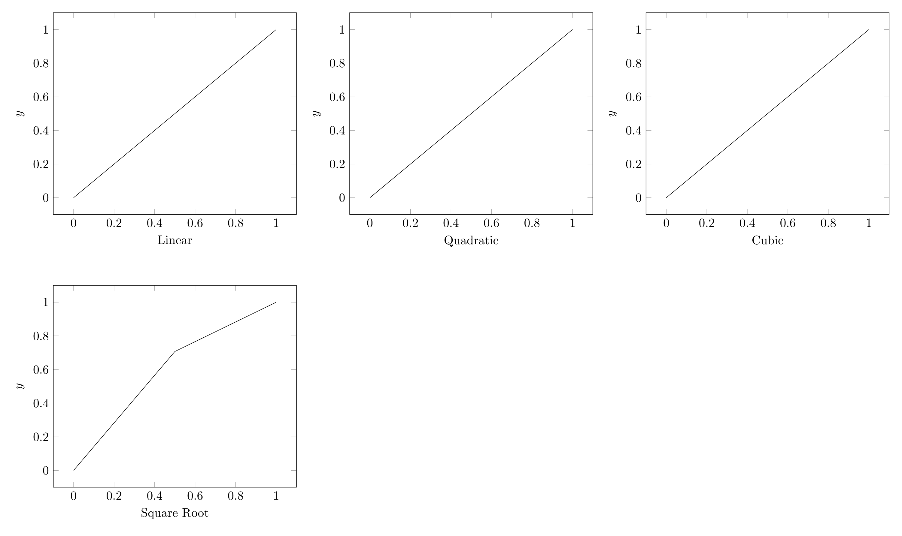
Show Tikz code
print(fig)\begin{tikzpicture} \begin{groupplot}[group style={group size=3 by 2, horizontal sep=1.5cm, vertical sep=2.0cm}] \nextgroupplot[xlabel=Linear, ylabel=$y$, grid=major] \addplot[] coordinates {(0,0) (1,1)};
\nextgroupplot[xlabel=Quadratic, ylabel=$y$, grid=major] \addplot[plot style=dashed] coordinates {(0,0) (1,1)};
\nextgroupplot[xlabel=Cubic, ylabel=$y$, grid=major] \addplot[plot style=dotted] coordinates {(0,0) (1,1)};
\nextgroupplot[xlabel=Square Root, ylabel=$y$, grid=major] \addplot[] coordinates {(0,0.0) (0.5,0.7071067811865476) (1,1.0)};
\end{groupplot}\end{tikzpicture}print(fig.generate_standalone())\documentclass[border=10pt]{standalone}\PassOptionsToPackage{dvipsnames,svgnames,x11names}{xcolor}\usepackage{tikz}\usepackage{pgfplots}\pgfplotsset{compat=newest}\usepgfplotslibrary{groupplots}\usetikzlibrary{arrows.meta}\begin{document}\begin{tikzpicture} \begin{groupplot}[group style={group size=3 by 2, horizontal sep=1.5cm, vertical sep=2.0cm}] \nextgroupplot[xlabel=Linear, ylabel=$y$, grid=major] \addplot[] coordinates {(0,0) (1,1)};
\nextgroupplot[xlabel=Quadratic, ylabel=$y$, grid=major] \addplot[plot style=dashed] coordinates {(0,0) (1,1)};
\nextgroupplot[xlabel=Cubic, ylabel=$y$, grid=major] \addplot[plot style=dotted] coordinates {(0,0) (1,1)};
\nextgroupplot[xlabel=Square Root, ylabel=$y$, grid=major] \addplot[] coordinates {(0,0.0) (0.5,0.7071067811865476) (1,1.0)};
\end{groupplot}\end{tikzpicture}
\end{document}Grid data comparison
Section titled “Grid data comparison”A practical 2x2 comparison:
fig = TikzFigure(rows=2, cols=2)
# Linearax1 = fig.subfigure_axis(    xlabel="Time",    ylabel="Value",    width=0.45,)ax1.add_plot(    [0, 1, 2, 3, 4],    [0, 2, 4, 6, 8],    label="Linear",    marker="*",)ax1.set_legend()
# Exponentialax2 = fig.subfigure_axis(    xlabel="Time",    ylabel="Value",    width=0.45,)ax2.add_plot(    [0, 1, 2, 3, 4],    [1, 2, 4, 8, 16],    label="Exponential",    marker="o",)ax2.set_legend()
# Sine waveax3 = fig.subfigure_axis(    xlabel="Time",    ylabel="Amplitude",    width=0.45,)x = [i * 0.2 for i in range(26)]ax3.add_plot(    x,    [math.sin(xi) for xi in x],    label="Sine",)ax3.set_legend()
# All togetherax4 = fig.subfigure_axis(    xlabel="Time",    ylabel="Value",    width=0.45,)ax4.add_plot(    [0, 1, 2, 3, 4],    [0, 2, 4, 6, 8],    label="Linear",)ax4.add_plot(    [0, 1, 2, 3],    [1, 2, 4, 8],    label="Exponential",)ax4.set_legend()
fig.show()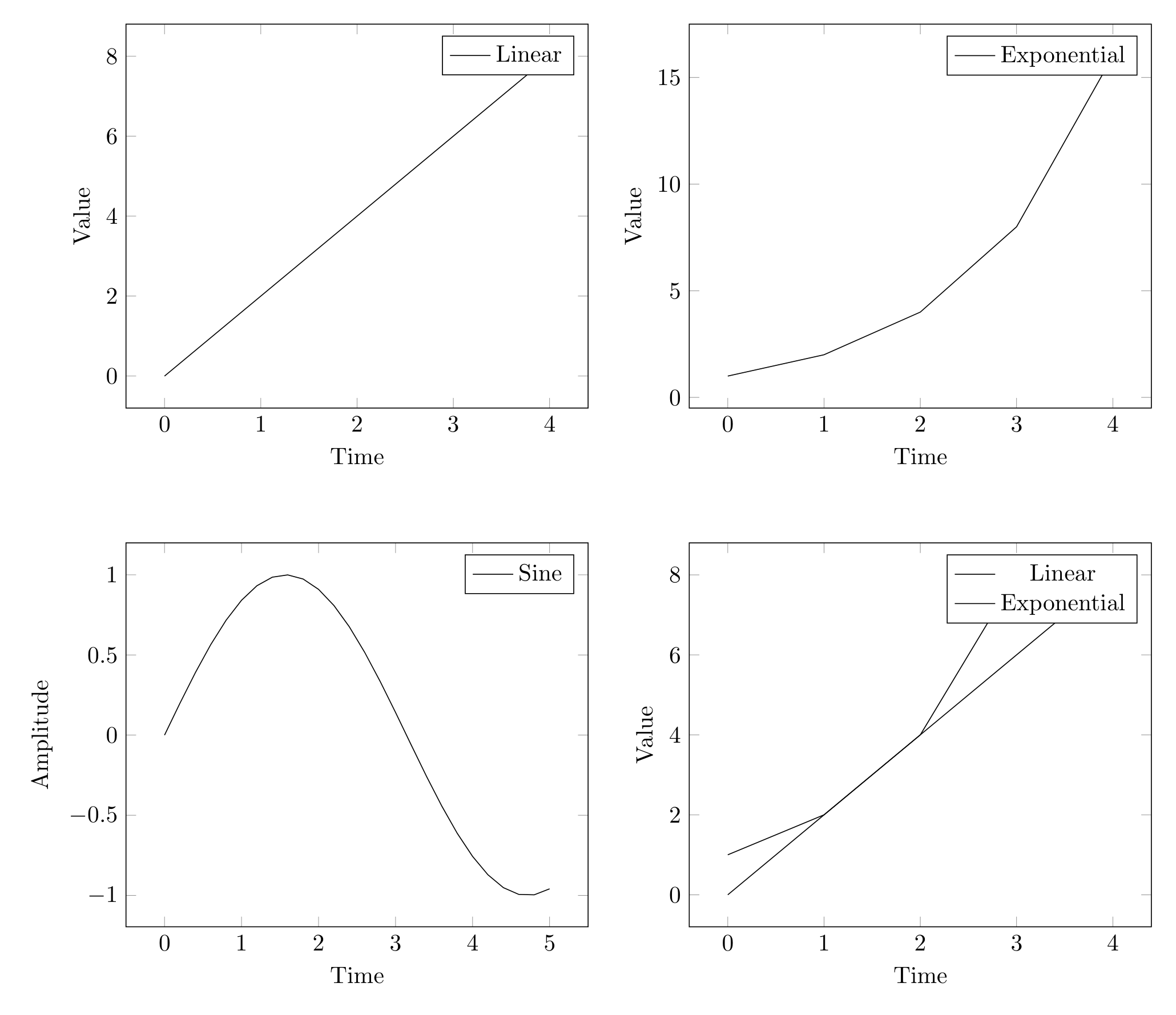
Show Tikz code
print(fig)\begin{tikzpicture} \begin{groupplot}[group style={group size=2 by 2, horizontal sep=1.5cm, vertical sep=2.0cm}] \nextgroupplot[xlabel=Time, ylabel=Value, grid=major, legend pos=north east] \addplot[marker=*] coordinates {(0,0) (1,2) (2,4) (3,6) (4,8)}; \legend{Linear}
\nextgroupplot[xlabel=Time, ylabel=Value, grid=major, legend pos=north east] \addplot[marker=o] coordinates {(0,1) (1,2) (2,4) (3,8) (4,16)}; \legend{Exponential}
\nextgroupplot[xlabel=Time, ylabel=Amplitude, grid=major, legend pos=north east] \addplot[] coordinates {(0.0,0.0) (0.2,0.19866933079506122) (0.4,0.3894183423086505) (0.6000000000000001,0.5646424733950355) (0.8,0.7173560908995228) (1.0,0.8414709848078965) (1.2000000000000002,0.9320390859672264) (1.4000000000000001,0.9854497299884603) (1.6,0.9995736030415051) (1.8,0.9738476308781951) (2.0,0.9092974268256817) (2.2,0.8084964038195901) (2.4000000000000004,0.6754631805511506) (2.6,0.5155013718214642) (2.8000000000000003,0.33498815015590466) (3.0,0.1411200080598672) (3.2,-0.058374143427580086) (3.4000000000000004,-0.25554110202683167) (3.6,-0.44252044329485246) (3.8000000000000003,-0.6118578909427193) (4.0,-0.7568024953079282) (4.2,-0.8715757724135882) (4.4,-0.951602073889516) (4.6000000000000005,-0.9936910036334645) (4.800000000000001,-0.9961646088358406) (5.0,-0.9589242746631385)}; \legend{Sine}
\nextgroupplot[xlabel=Time, ylabel=Value, grid=major, legend pos=north east] \addplot[] coordinates {(0,0) (1,2) (2,4) (3,6) (4,8)}; \addplot[] coordinates {(0,1) (1,2) (2,4) (3,8)}; \legend{Linear, Exponential}
\end{groupplot}\end{tikzpicture}print(fig.generate_standalone())\documentclass[border=10pt]{standalone}\PassOptionsToPackage{dvipsnames,svgnames,x11names}{xcolor}\usepackage{tikz}\usepackage{pgfplots}\pgfplotsset{compat=newest}\usepgfplotslibrary{groupplots}\usetikzlibrary{arrows.meta}\begin{document}\begin{tikzpicture} \begin{groupplot}[group style={group size=2 by 2, horizontal sep=1.5cm, vertical sep=2.0cm}] \nextgroupplot[xlabel=Time, ylabel=Value, grid=major, legend pos=north east] \addplot[marker=*] coordinates {(0,0) (1,2) (2,4) (3,6) (4,8)}; \legend{Linear}
\nextgroupplot[xlabel=Time, ylabel=Value, grid=major, legend pos=north east] \addplot[marker=o] coordinates {(0,1) (1,2) (2,4) (3,8) (4,16)}; \legend{Exponential}
\nextgroupplot[xlabel=Time, ylabel=Amplitude, grid=major, legend pos=north east] \addplot[] coordinates {(0.0,0.0) (0.2,0.19866933079506122) (0.4,0.3894183423086505) (0.6000000000000001,0.5646424733950355) (0.8,0.7173560908995228) (1.0,0.8414709848078965) (1.2000000000000002,0.9320390859672264) (1.4000000000000001,0.9854497299884603) (1.6,0.9995736030415051) (1.8,0.9738476308781951) (2.0,0.9092974268256817) (2.2,0.8084964038195901) (2.4000000000000004,0.6754631805511506) (2.6,0.5155013718214642) (2.8000000000000003,0.33498815015590466) (3.0,0.1411200080598672) (3.2,-0.058374143427580086) (3.4000000000000004,-0.25554110202683167) (3.6,-0.44252044329485246) (3.8000000000000003,-0.6118578909427193) (4.0,-0.7568024953079282) (4.2,-0.8715757724135882) (4.4,-0.951602073889516) (4.6000000000000005,-0.9936910036334645) (4.800000000000001,-0.9961646088358406) (5.0,-0.9589242746631385)}; \legend{Sine}
\nextgroupplot[xlabel=Time, ylabel=Value, grid=major, legend pos=north east] \addplot[] coordinates {(0,0) (1,2) (2,4) (3,6) (4,8)}; \addplot[] coordinates {(0,1) (1,2) (2,4) (3,8)}; \legend{Linear, Exponential}
\end{groupplot}\end{tikzpicture}
\end{document}Mixing plots and diagrams
Section titled “Mixing plots and diagrams”Use subfigure() to place bare TikZ diagrams alongside axis-based
plots. The returned object supports node(), draw(), and all TikZ API
methods:
fig = TikzFigure(rows=1, cols=2)
# Left: axis with plotax = fig.subfigure_axis(    xlabel="Iteration",    ylabel="Error",    width=0.4,)ax.add_plot(    [1, 2, 3, 4, 5],    [0.8, 0.4, 0.2, 0.1, 0.05],    marker="o",    label="Convergence",)ax.set_legend()
# Right: algorithm flowchartflowchart = fig.subfigure(width=0.4, height=6)start = flowchart.node(    1.5,    3.5,    label="start",    content="Start",    shape="circle",    fill="green!40",)process = flowchart.node(    1.5,    2,    label="process",    content="Iterate",    shape="rectangle",    fill="yellow!40",)end = flowchart.node(    1.5,    0.5,    label="end",    content="Done",    shape="circle",    fill="red!40",)flowchart.draw([start, process], arrows=arrows.forward)flowchart.draw([process, end], arrows=arrows.forward)
fig.show()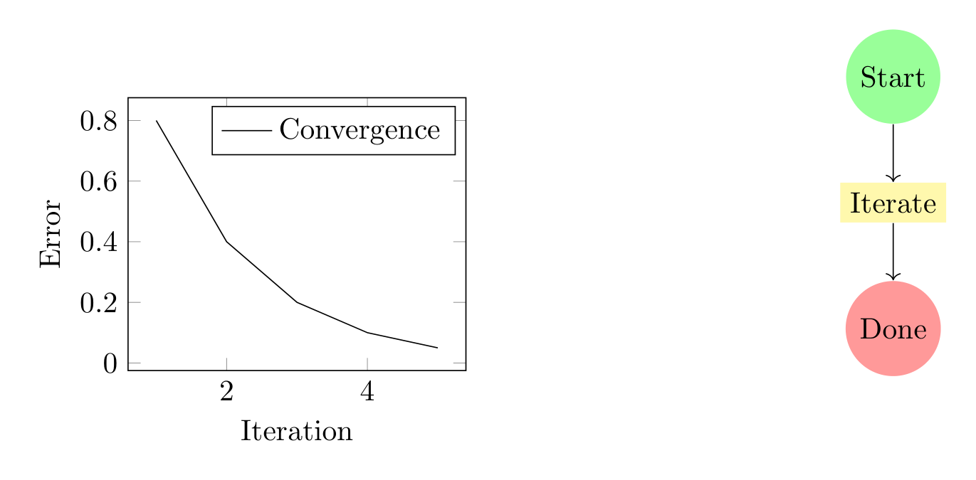
Show Tikz code
print(fig)\begin{tikzpicture} \begin{scope}[xshift=0.0cm, yshift=0.0cm] \begin{axis}[width=5.6cm, xlabel=Iteration, ylabel=Error, grid=major, legend pos=north east] \addplot[marker=o] coordinates {(1,0.8) (2,0.4) (3,0.2) (4,0.1) (5,0.05)}; \legend{Convergence} \end{axis} \end{scope} \begin{scope}[xshift=7.1cm, yshift=0.0cm] \node[shape=circle, fill=green!40] (start) at ({1.5}, {3.5}) {Start}; \node[shape=rectangle, fill=yellow!40] (process) at ({1.5}, {2}) {Iterate}; \node[shape=circle, fill=red!40] (end) at ({1.5}, {0.5}) {Done}; \draw[->] (start) to (process); \draw[->] (process) to (end); \end{scope}\end{tikzpicture}print(fig.generate_standalone())\documentclass[border=10pt]{standalone}\PassOptionsToPackage{dvipsnames,svgnames,x11names}{xcolor}\usepackage{tikz}\usepackage{pgfplots}\pgfplotsset{compat=newest}\usepgfplotslibrary{groupplots}\usetikzlibrary{arrows.meta}\begin{document}\begin{tikzpicture} \begin{scope}[xshift=0.0cm, yshift=0.0cm] \begin{axis}[width=5.6cm, xlabel=Iteration, ylabel=Error, grid=major, legend pos=north east] \addplot[marker=o] coordinates {(1,0.8) (2,0.4) (3,0.2) (4,0.1) (5,0.05)}; \legend{Convergence} \end{axis} \end{scope} \begin{scope}[xshift=7.1cm, yshift=0.0cm] \node[shape=circle, fill=green!40] (start) at ({1.5}, {3.5}) {Start}; \node[shape=rectangle, fill=yellow!40] (process) at ({1.5}, {2}) {Iterate}; \node[shape=circle, fill=red!40] (end) at ({1.5}, {0.5}) {Done}; \draw[->] (start) to (process); \draw[->] (process) to (end); \end{scope}\end{tikzpicture}
\end{document}See Mixed Subfigures for more detailed examples.