2D Plots: Basics
tikzfigure provides a high-level API for creating publication-quality 2D plots using pgfplots. This tutorial covers the fundamentals:
- Creating a 2D axis with
axis2d() - Adding data plots
- Axis labels, limits, and grids
- Linear and logarithmic axes
- Multiple plots on one axis
- Controlling plot dimensions
from tikzfigure import TikzFigureYour first 2D plot
Section titled “Your first 2D plot”A 2D plot starts with creating an axis via axis2d(), then adding data
with add_plot().
fig = TikzFigure()
# Create a 2D axisax = fig.axis2d(xlabel="$X$", ylabel="$Y$")
# Add a plot with x and y dataax.add_plot([0, 1, 2, 3, 4], [0, 1, 4, 9, 16])
fig.show()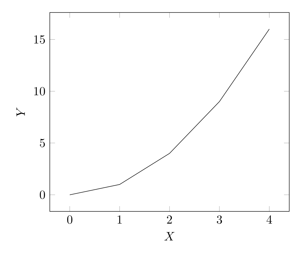
Show Tikz code
print(fig)% --------------------------------------------- %% Tikzfigure generated by tikzfigure v0.3.1 %% https://github.com/max-models/tikzfigure %% --------------------------------------------- %\begin{tikzpicture} \begin{axis}[xlabel=$X$, ylabel=$Y$, grid=major] \addplot[] coordinates {(0,0) (1,1) (2,4) (3,9) (4,16)}; \end{axis}\end{tikzpicture}print(fig.generate_standalone())\documentclass[border=10pt]{standalone}\PassOptionsToPackage{dvipsnames,svgnames,x11names}{xcolor}\usepackage{tikz}\usepackage{pgfplots}\pgfplotsset{compat=newest}\usepgfplotslibrary{groupplots}\usetikzlibrary{arrows.meta}\usepackage{pgfplots}\begin{document}% --------------------------------------------- %% Tikzfigure generated by tikzfigure v0.3.1 %% https://github.com/max-models/tikzfigure %% --------------------------------------------- %\begin{tikzpicture} \begin{axis}[xlabel=$X$, ylabel=$Y$, grid=major] \addplot[] coordinates {(0,0) (1,1) (2,4) (3,9) (4,16)}; \end{axis}\end{tikzpicture}
\end{document}pgfplots automatically scales the axes to fit the data.
Adding labels and limits
Section titled “Adding labels and limits”Axis labels and explicit limits make plots more readable:
fig = TikzFigure()
ax = fig.axis2d(    xlabel="Time (seconds)",    ylabel="Distance (meters)",    xlim=(0, 5),    ylim=(0, 30),    grid=True,)
time = [0, 1, 2, 3, 4, 5]distance = [0, 2.5, 10, 22.5, 40, 62.5]
ax.add_plot(time, distance, label="motion")
fig.show()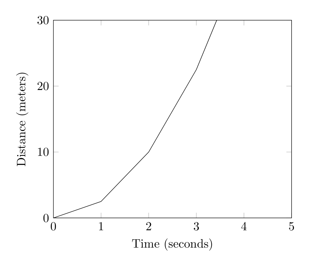
Show Tikz code
print(fig)% --------------------------------------------- %% Tikzfigure generated by tikzfigure v0.3.1 %% https://github.com/max-models/tikzfigure %% --------------------------------------------- %\begin{tikzpicture} \begin{axis}[xlabel=Time (seconds), ylabel=Distance (meters), xmin=0, xmax=5, ymin=0, ymax=30, grid=major] \addplot[] coordinates {(0,0) (1,2.5) (2,10) (3,22.5) (4,40) (5,62.5)}; \end{axis}\end{tikzpicture}print(fig.generate_standalone())\documentclass[border=10pt]{standalone}\PassOptionsToPackage{dvipsnames,svgnames,x11names}{xcolor}\usepackage{tikz}\usepackage{pgfplots}\pgfplotsset{compat=newest}\usepgfplotslibrary{groupplots}\usetikzlibrary{arrows.meta}\usepackage{pgfplots}\begin{document}% --------------------------------------------- %% Tikzfigure generated by tikzfigure v0.3.1 %% https://github.com/max-models/tikzfigure %% --------------------------------------------- %\begin{tikzpicture} \begin{axis}[xlabel=Time (seconds), ylabel=Distance (meters), xmin=0, xmax=5, ymin=0, ymax=30, grid=major] \addplot[] coordinates {(0,0) (1,2.5) (2,10) (3,22.5) (4,40) (5,62.5)}; \end{axis}\end{tikzpicture}
\end{document}grid=True adds grid lines. xlim and ylim set explicit axis ranges.
Log-scale axes
Section titled “Log-scale axes”Use xlog=True and ylog=True to switch either axis (or both) to
logarithmic scale.
fig = TikzFigure()
# Semilog-x plot (x axis logarithmic, y axis linear)ax = fig.axis2d(    xlabel="Frequency (Hz)",    ylabel="Gain",    xlim=(1, 10000),    ylim=(0.1, 100),    xlog=True,    grid=True,)ax.add_plot(    [1, 10, 100, 1000, 10000],    [0.2, 2, 5, 50, 100],    label="semilog-x",    color="blue",    mark="*",)
fig.show()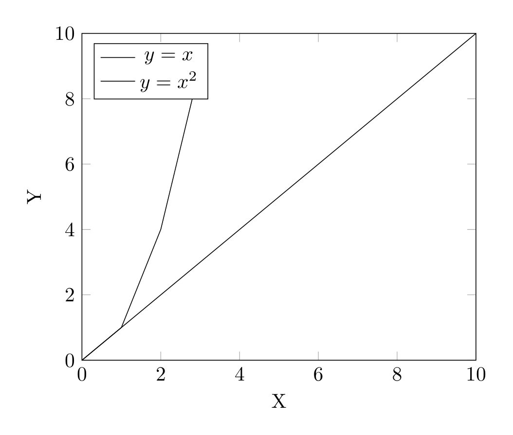
Show Tikz code
print(fig)% --------------------------------------------- %% Tikzfigure generated by tikzfigure v0.3.1 %% https://github.com/max-models/tikzfigure %% --------------------------------------------- %\begin{tikzpicture} \begin{axis}[xlabel=Frequency (Hz), ylabel=Gain, xmin=1, xmax=10000, ymin=0.1, ymax=100, xmode=log, grid=major] \addplot[color=blue, mark=*] coordinates {(1,0.2) (10,2) (100,5) (1000,50) (10000,100)}; \end{axis}\end{tikzpicture}print(fig.generate_standalone())\documentclass[border=10pt]{standalone}\PassOptionsToPackage{dvipsnames,svgnames,x11names}{xcolor}\usepackage{tikz}\usepackage{pgfplots}\pgfplotsset{compat=newest}\usepgfplotslibrary{groupplots}\usetikzlibrary{arrows.meta}\usepackage{pgfplots}\begin{document}% --------------------------------------------- %% Tikzfigure generated by tikzfigure v0.3.1 %% https://github.com/max-models/tikzfigure %% --------------------------------------------- %\begin{tikzpicture} \begin{axis}[xlabel=Frequency (Hz), ylabel=Gain, xmin=1, xmax=10000, ymin=0.1, ymax=100, xmode=log, grid=major] \addplot[color=blue, mark=*] coordinates {(1,0.2) (10,2) (100,5) (1000,50) (10000,100)}; \end{axis}\end{tikzpicture}
\end{document}Multiple plots on one axis
Section titled “Multiple plots on one axis”A single axis can hold multiple plots for comparisons:
fig = TikzFigure()
ax = fig.axis2d(    xlabel="X",    ylabel="Y",    xlim=(0, 10),    ylim=(0, 10),    grid=True,)
ax.add_plot(    [0, 2, 4, 6, 8, 10],    [0, 2, 4, 6, 8, 10],    label="$y = x$",)ax.add_plot(    [0, 1, 2, 3],    [0, 1, 4, 9],    label="$y = x^2$",)
ax.set_legend(position="north west")
fig.show()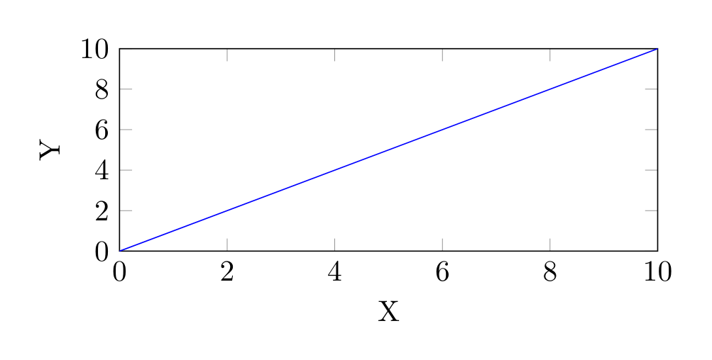
Show Tikz code
print(fig)% --------------------------------------------- %% Tikzfigure generated by tikzfigure v0.3.1 %% https://github.com/max-models/tikzfigure %% --------------------------------------------- %\begin{tikzpicture} \begin{axis}[xlabel=X, ylabel=Y, xmin=0, xmax=10, ymin=0, ymax=10, grid=major, legend pos=north west] \addplot[] coordinates {(0,0) (2,2) (4,4) (6,6) (8,8) (10,10)}; \addplot[] coordinates {(0,0) (1,1) (2,4) (3,9)}; \legend{$y = x$, $y = x^2$} \end{axis}\end{tikzpicture}print(fig.generate_standalone())\documentclass[border=10pt]{standalone}\PassOptionsToPackage{dvipsnames,svgnames,x11names}{xcolor}\usepackage{tikz}\usepackage{pgfplots}\pgfplotsset{compat=newest}\usepgfplotslibrary{groupplots}\usetikzlibrary{arrows.meta}\usepackage{pgfplots}\begin{document}% --------------------------------------------- %% Tikzfigure generated by tikzfigure v0.3.1 %% https://github.com/max-models/tikzfigure %% --------------------------------------------- %\begin{tikzpicture} \begin{axis}[xlabel=X, ylabel=Y, xmin=0, xmax=10, ymin=0, ymax=10, grid=major, legend pos=north west] \addplot[] coordinates {(0,0) (2,2) (4,4) (6,6) (8,8) (10,10)}; \addplot[] coordinates {(0,0) (1,1) (2,4) (3,9)}; \legend{$y = x$, $y = x^2$} \end{axis}\end{tikzpicture}
\end{document}Controlling plot dimensions
Section titled “Controlling plot dimensions”Override the default sizing with explicit width and height:
fig = TikzFigure()
ax = fig.axis2d(    xlabel="X",    ylabel="Y",    xlim=(0, 10),    ylim=(0, 10),    width="8cm",    height="4cm",    grid=True,)
ax.add_plot(    x=[0, 5, 10],    y=[0, 5, 10],    label="Linear",    color="blue",)
fig.show()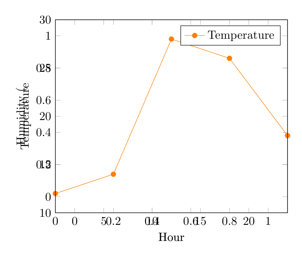
Show Tikz code
print(fig)% --------------------------------------------- %% Tikzfigure generated by tikzfigure v0.3.1 %% https://github.com/max-models/tikzfigure %% --------------------------------------------- %\begin{tikzpicture} \begin{axis}[xlabel=X, ylabel=Y, xmin=0, xmax=10, ymin=0, ymax=10, grid=major, width=8cm, height=4cm] \addplot[color=blue] coordinates {(0,0) (5,5) (10,10)}; \end{axis}\end{tikzpicture}print(fig.generate_standalone())\documentclass[border=10pt]{standalone}\PassOptionsToPackage{dvipsnames,svgnames,x11names}{xcolor}\usepackage{tikz}\usepackage{pgfplots}\pgfplotsset{compat=newest}\usepgfplotslibrary{groupplots}\usetikzlibrary{arrows.meta}\usepackage{pgfplots}\begin{document}% --------------------------------------------- %% Tikzfigure generated by tikzfigure v0.3.1 %% https://github.com/max-models/tikzfigure %% --------------------------------------------- %\begin{tikzpicture} \begin{axis}[xlabel=X, ylabel=Y, xmin=0, xmax=10, ymin=0, ymax=10, grid=major, width=8cm, height=4cm] \addplot[color=blue] coordinates {(0,0) (5,5) (10,10)}; \end{axis}\end{tikzpicture}
\end{document}Dimensions can be specified as:
- Numbers (cm):
width=8, height=6 - Strings with units:
width="8cm", height="6pt" - None (default): pgfplots auto-sizes the axis
Multiple independent axes
Section titled “Multiple independent axes”Call axis2d() multiple times for separate plots rendered in sequence:
fig = TikzFigure()
ax1 = fig.axis2d(    xlabel="Hour",    ylabel="Temperature",    xlim=(0, 24),    ylim=(10, 30),    grid=True,)ax1.add_plot(    [0, 6, 12, 18, 24],    [12, 14, 28, 26, 18],    label="Temperature",    color="orange",    mark="*",)ax1.set_legend(position="north east")
ax2 = fig.axis2d(    xlabel="Hour",    ylabel="Humidity (%)",    xlim=(0, 24),    ylim=(30, 90),    grid=True,)ax2.add_plot(    [0, 6, 12, 18, 24],    [70, 65, 40, 35, 55],    label="Humidity",    color="cyan",    mark="square",)ax2.set_legend(position="south east")
fig.show()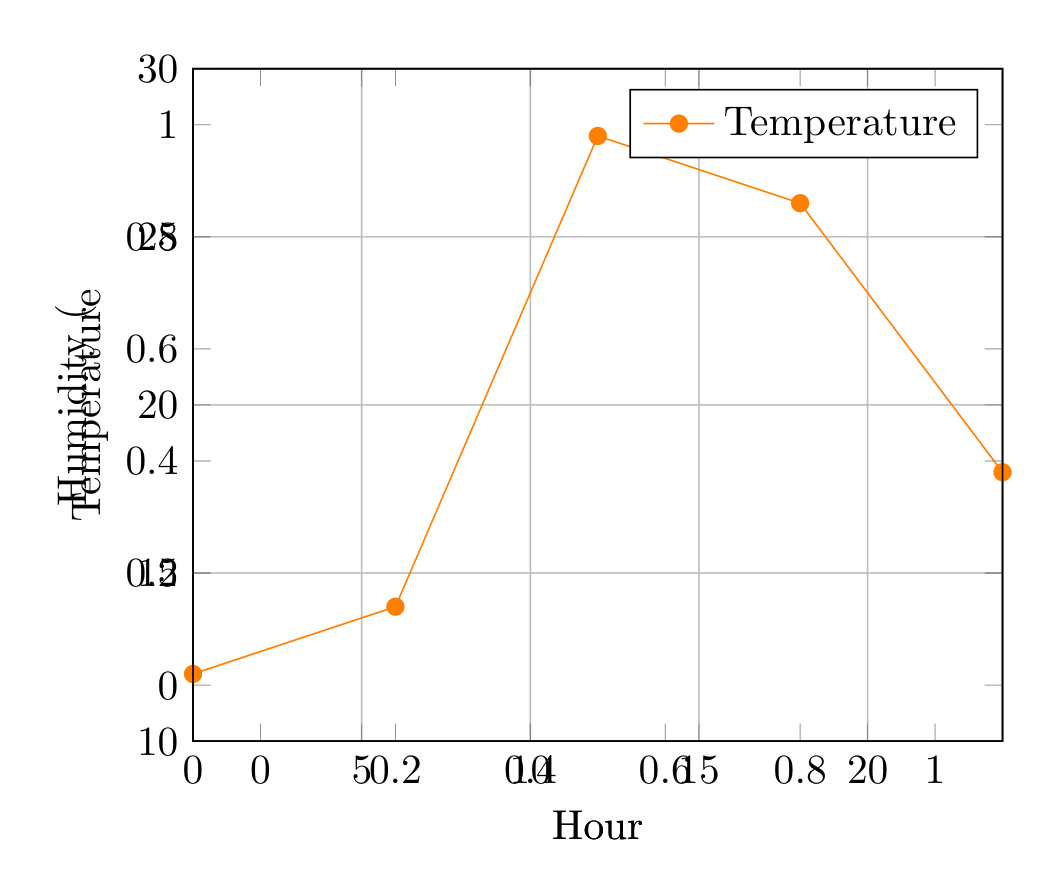
Show Tikz code
print(fig)% --------------------------------------------- %% Tikzfigure generated by tikzfigure v0.3.1 %% https://github.com/max-models/tikzfigure %% --------------------------------------------- %\begin{tikzpicture} \begin{axis}[xlabel=Hour, ylabel=Temperature, xmin=0, xmax=24, ymin=10, ymax=30, grid=major, legend pos=north east] \addplot[color=orange, mark=*] coordinates {(0,12) (6,14) (12,28) (18,26) (24,18)}; \legend{Temperature} \end{axis} \begin{axis}[xlabel=Hour, ylabel=Humidity (%), xmin=0, xmax=24, ymin=30, ymax=90, grid=major, legend pos=south east] \addplot[color=cyan, mark=square] coordinates {(0,70) (6,65) (12,40) (18,35) (24,55)}; \legend{Humidity} \end{axis}\end{tikzpicture}print(fig.generate_standalone())\documentclass[border=10pt]{standalone}\PassOptionsToPackage{dvipsnames,svgnames,x11names}{xcolor}\usepackage{tikz}\usepackage{pgfplots}\pgfplotsset{compat=newest}\usepgfplotslibrary{groupplots}\usetikzlibrary{arrows.meta}\usepackage{pgfplots}\begin{document}% --------------------------------------------- %% Tikzfigure generated by tikzfigure v0.3.1 %% https://github.com/max-models/tikzfigure %% --------------------------------------------- %\begin{tikzpicture} \begin{axis}[xlabel=Hour, ylabel=Temperature, xmin=0, xmax=24, ymin=10, ymax=30, grid=major, legend pos=north east] \addplot[color=orange, mark=*] coordinates {(0,12) (6,14) (12,28) (18,26) (24,18)}; \legend{Temperature} \end{axis} \begin{axis}[xlabel=Hour, ylabel=Humidity (%), xmin=0, xmax=24, ymin=30, ymax=90, grid=major, legend pos=south east] \addplot[color=cyan, mark=square] coordinates {(0,70) (6,65) (12,40) (18,35) (24,55)}; \legend{Humidity} \end{axis}\end{tikzpicture}
\end{document}