Tutorial 11: Gantt Charts
This tutorial demonstrates how to create Gantt charts using maxplotlib across different backends.
Gantt charts are useful for visualizing project schedules, task timelines, and resource allocation.
[1]:
from maxplotlib import Canvas
Basic Gantt Chart
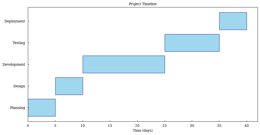
Let’s create a simple project timeline with 5 tasks.
[2]:
# Define project tasks
tasks = ["Planning", "Design", "Development", "Testing", "Deployment"]
start_times = [0, 5, 10, 25, 35]  # Days from project start
durations = [5, 5, 15, 10, 5]  # Duration in days

# Create canvas and add gantt chart
canvas = Canvas(nrows=1, ncols=1, figsize=(12, 6))
canvas.gantt(
    tasks=tasks,
    start_times=start_times,
    durations=durations,
    color="skyblue",
    edgecolor="navy",
    alpha=0.8,
)

canvas.set_xlabel("Time (days)")
canvas.set_title("Project Timeline")
canvas.render(backend="matplotlib")
[2]:
(<Figure size 1200x600 with 1 Axes>,
 array([[<Axes: title={'center': 'Project Timeline'}, xlabel='Time (days)'>]],
       dtype=object))
Multiple Project Phases
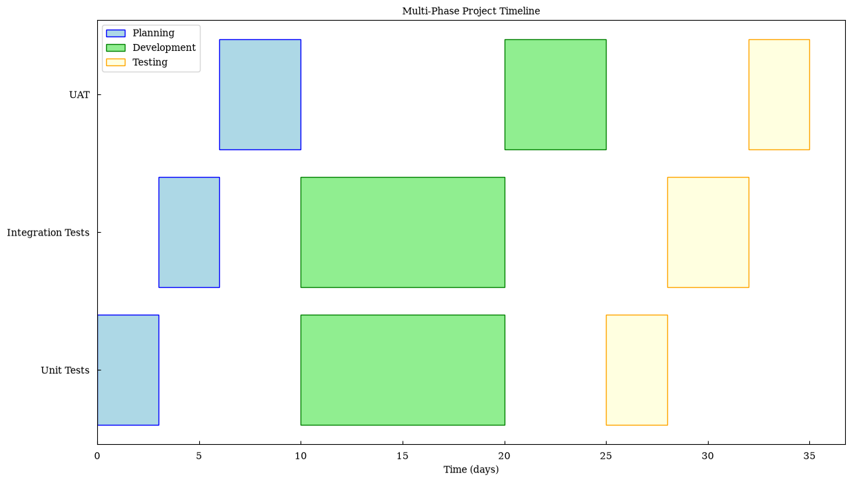
Visualize different project phases with different colors using layers.
[3]:
# Phase 1: Planning and Design
phase1_tasks = ["Requirements", "Architecture", "UI Design"]
phase1_starts = [0, 3, 6]
phase1_durations = [3, 3, 4]

# Phase 2: Implementation
phase2_tasks = ["Backend Dev", "Frontend Dev", "Integration"]
phase2_starts = [10, 10, 20]
phase2_durations = [10, 10, 5]

# Phase 3: Quality Assurance
phase3_tasks = ["Unit Tests", "Integration Tests", "UAT"]
phase3_starts = [25, 28, 32]
phase3_durations = [3, 4, 3]

canvas = Canvas(nrows=1, ncols=1, figsize=(14, 8))

# Add each phase with different colors
canvas.gantt(
    phase1_tasks,
    phase1_starts,
    phase1_durations,
    color="lightblue",
    edgecolor="blue",
    label="Planning",
)
canvas.gantt(
    phase2_tasks,
    phase2_starts,
    phase2_durations,
    color="lightgreen",
    edgecolor="green",
    label="Development",
)
canvas.gantt(
    phase3_tasks,
    phase3_starts,
    phase3_durations,
    color="lightyellow",
    edgecolor="orange",
    label="Testing",
)

canvas.set_xlabel("Time (days)")
canvas.set_title("Multi-Phase Project Timeline")
canvas.set_legend(True)
canvas.render(backend="matplotlib")
[3]:
(<Figure size 1400x800 with 1 Axes>,
 array([[<Axes: title={'center': 'Multi-Phase Project Timeline'}, xlabel='Time (days)'>]],
       dtype=object))
Resource Allocation
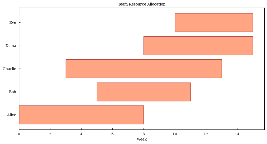
Show how different team members are allocated across tasks.
[4]:
# Team member assignments
team_members = ["Alice", "Bob", "Charlie", "Diana", "Eve"]
task_starts = [0, 5, 3, 8, 10]
task_durations = [8, 6, 10, 7, 5]

canvas = Canvas(nrows=1, ncols=1, figsize=(12, 6))
canvas.gantt(
    tasks=team_members,
    start_times=task_starts,
    durations=task_durations,
    color="coral",
    edgecolor="darkred",
    alpha=0.7,
)

canvas.set_xlabel("Week")
canvas.set_title("Team Resource Allocation")
canvas.render(backend="matplotlib")
[4]:
(<Figure size 1200x600 with 1 Axes>,
 array([[<Axes: title={'center': 'Team Resource Allocation'}, xlabel='Week'>]],
       dtype=object))
Interactive Gantt Chart with Plotly
Create an interactive version that allows zooming and hovering.
[5]:
tasks = ["Research", "Prototype", "Development", "Testing", "Launch"]
start_times = [0, 10, 20, 40, 50]
durations = [10, 10, 20, 10, 5]

canvas = Canvas(nrows=1, ncols=1, figsize=(12, 6))
canvas.gantt(
    tasks=tasks,
    start_times=start_times,
    durations=durations,
    color="steelblue",
    alpha=0.8,
)

canvas.set_xlabel("Days")
canvas.set_title("Interactive Project Timeline")
fig = canvas.render(backend="plotly")
fig.show()
Data type cannot be displayed: application/vnd.plotly.v1+json
Milestones and Dependencies
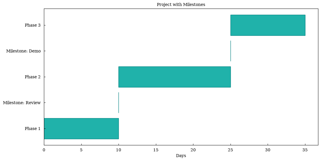
Visualize project milestones (zero-duration tasks) alongside regular tasks.
[6]:
# Regular tasks
tasks = ["Phase 1", "Milestone: Review", "Phase 2", "Milestone: Demo", "Phase 3"]
start_times = [0, 10, 10, 25, 25]
durations = [10, 0, 15, 0, 10]  # Milestones have zero duration

canvas = Canvas(nrows=1, ncols=1, figsize=(12, 6))
canvas.gantt(
    tasks=tasks,
    start_times=start_times,
    durations=durations,
    color="lightseagreen",
    edgecolor="teal",
)

canvas.set_xlabel("Days")
canvas.set_title("Project with Milestones")
canvas.render(backend="matplotlib")
[6]:
(<Figure size 1200x600 with 1 Axes>,
 array([[<Axes: title={'center': 'Project with Milestones'}, xlabel='Days'>]],
       dtype=object))
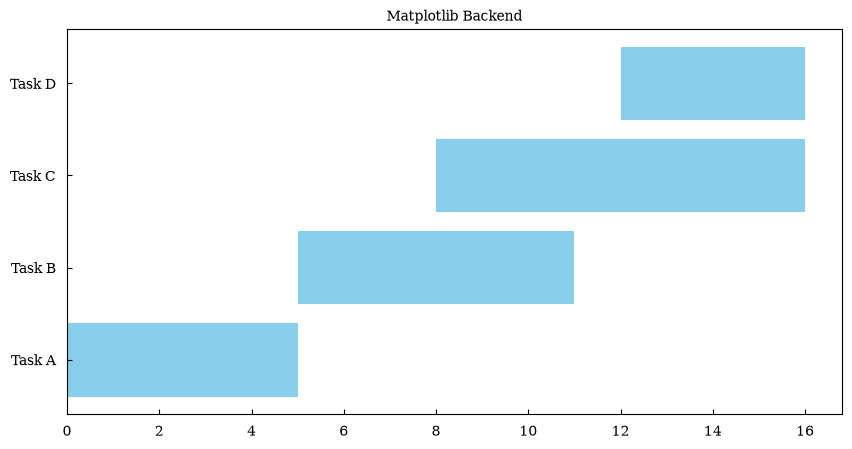
Comparison: Different Backends
The same Gantt chart rendered with different backends.
[7]:
tasks = ["Task A", "Task B", "Task C", "Task D"]
start_times = [0, 5, 8, 12]
durations = [5, 6, 8, 4]

# Matplotlib
canvas_mpl = Canvas(nrows=1, ncols=1, figsize=(10, 5))
canvas_mpl.gantt(tasks, start_times, durations, color="skyblue")
canvas_mpl.set_title("Matplotlib Backend")
canvas_mpl.render(backend="matplotlib")

# Plotly
canvas_plotly = Canvas(nrows=1, ncols=1, figsize=(10, 5))
canvas_plotly.gantt(tasks, start_times, durations, color="skyblue")
canvas_plotly.set_title("Plotly Backend")
fig = canvas_plotly.render(backend="plotly")
fig.show()
Data type cannot be displayed: application/vnd.plotly.v1+json
Summary
Gantt charts in maxplotlib support:
Simple task timelines
Multiple phases with different colors
Resource allocation visualization
Milestones (zero-duration tasks)
All backends: matplotlib, plotly, plotext, tikzfigure
Customizable colors, transparency, and edge colors