Tutorial 03 — Plot Types
maxplotlib exposes all common Matplotlib plot types through a unified API. This notebook demonstrates each type individually, then shows how to combine multiple types in a single subplot.
Plot types covered: plot · scatter · bar · fill_between · errorbar · axhline / axvline · hlines / vlines · combined plots · annotate / text
[1]:
from maxplotlib import Canvas
import numpy as np

%matplotlib inline

rng = np.random.default_rng(42)
x = np.linspace(0, 2 * np.pi, 300)
Backend selection
All examples in this tutorial use the same Canvas API; you can switch rendering backends at any time:
BACKEND = "matplotlib"for static Matplotlib outputBACKEND = "plotly"for interactive Plotly output (Jupyter-friendly)
Most cells end with canvas.show(backend=BACKEND) so you can re-run the whole notebook with a different backend.
[2]:
# Change to "plotly" for interactive output
BACKEND = "matplotlib"
1 Line plot — ax.plot()
[3]:
canvas, ax = Canvas.subplots()

ax.plot(x, np.sin(x), label="sin(x)", color="royalblue", linestyle="solid", linewidth=2)
ax.plot(x, np.cos(x), label="cos(x)", color="tomato", linestyle="dashed", linewidth=2)

ax.set_xlabel("x")
ax.set_ylabel("y")
ax.set_title("Line Plot")
ax.set_legend(True)
ax.set_grid(True)
canvas.show(backend=BACKEND)

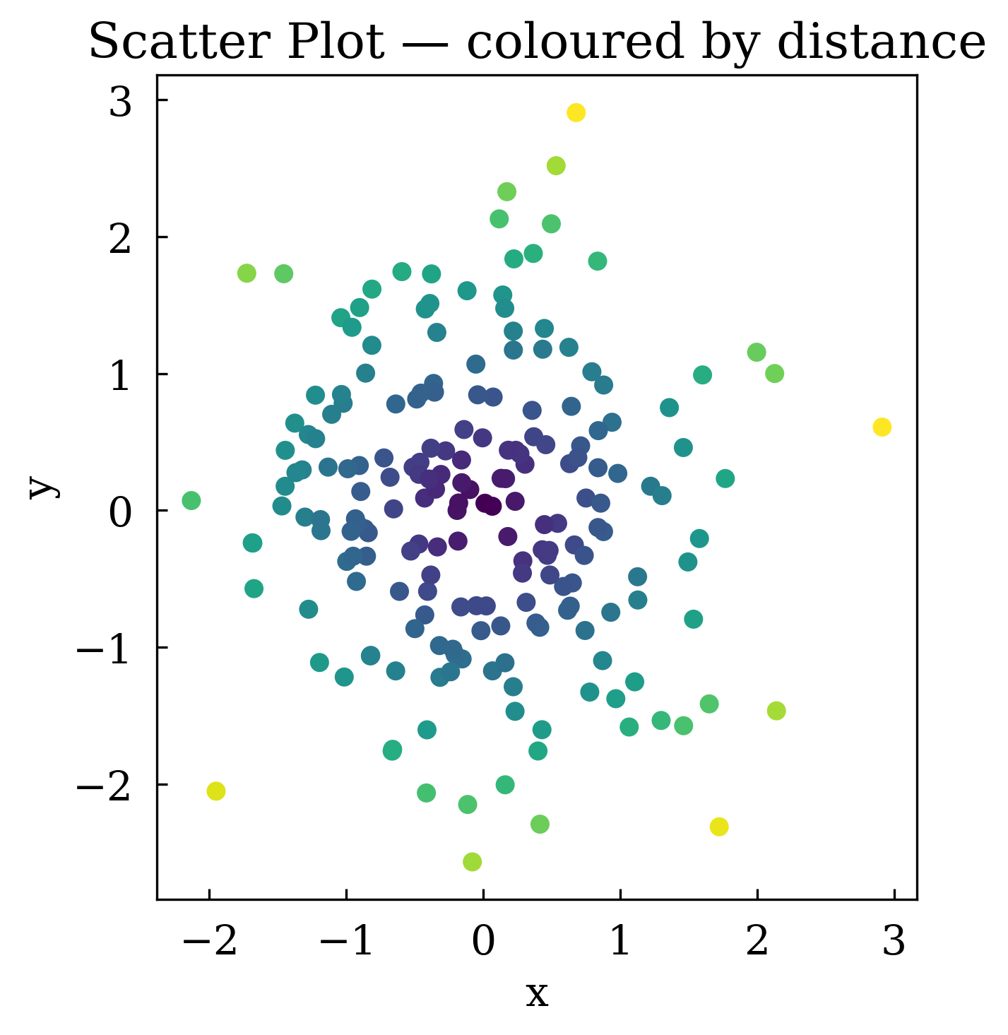
2 Scatter plot — ax.scatter()
Use c= to colour each point by a scalar value (requires a colormap-compatible array).
[4]:
n = 200
sx = rng.standard_normal(n)
sy = rng.standard_normal(n)
values = np.sqrt(sx**2 + sy**2)  # colour by distance from origin

canvas, ax = Canvas.subplots()
ax.scatter(sx, sy, c=values, s=30, label="data points")
ax.set_xlabel("x")
ax.set_ylabel("y")
ax.set_title("Scatter Plot — coloured by distance")
ax.set_aspect("equal")
canvas.show(backend=BACKEND)
3 Bar chart — ax.bar()
[5]:
categories = ["Jan", "Feb", "Mar", "Apr", "May", "Jun"]
values_bar = [12, 19, 15, 22, 30, 27]

canvas, ax = Canvas.subplots()
ax.bar(categories, values_bar, color="steelblue", width=0.6, label="monthly sales")
ax.set_xlabel("Month")
ax.set_ylabel("Sales (units)")
ax.set_title("Bar Chart")
ax.set_legend(True)
# canvas.show(backend=BACKEND) # TODO: Fix this error
4 Fill between — ax.fill_between()
Useful for shading confidence bands or uncertainty regions.
[6]:
t = np.linspace(0, 4 * np.pi, 300)
mean = np.sin(t) * np.exp(-t / 10)
upper = mean + 0.3 * (1 - t / (4 * np.pi))
lower = mean - 0.3 * (1 - t / (4 * np.pi))

canvas, ax = Canvas.subplots()
ax.plot(t, mean, color="royalblue", label="mean", linewidth=2)
ax.fill_between(t, lower, upper, alpha=0.25, color="royalblue", label="±1 std")
ax.set_xlabel("t")
ax.set_ylabel("value")
ax.set_title("Fill Between — Confidence Band")
ax.set_legend(True)
canvas.show(backend=BACKEND)
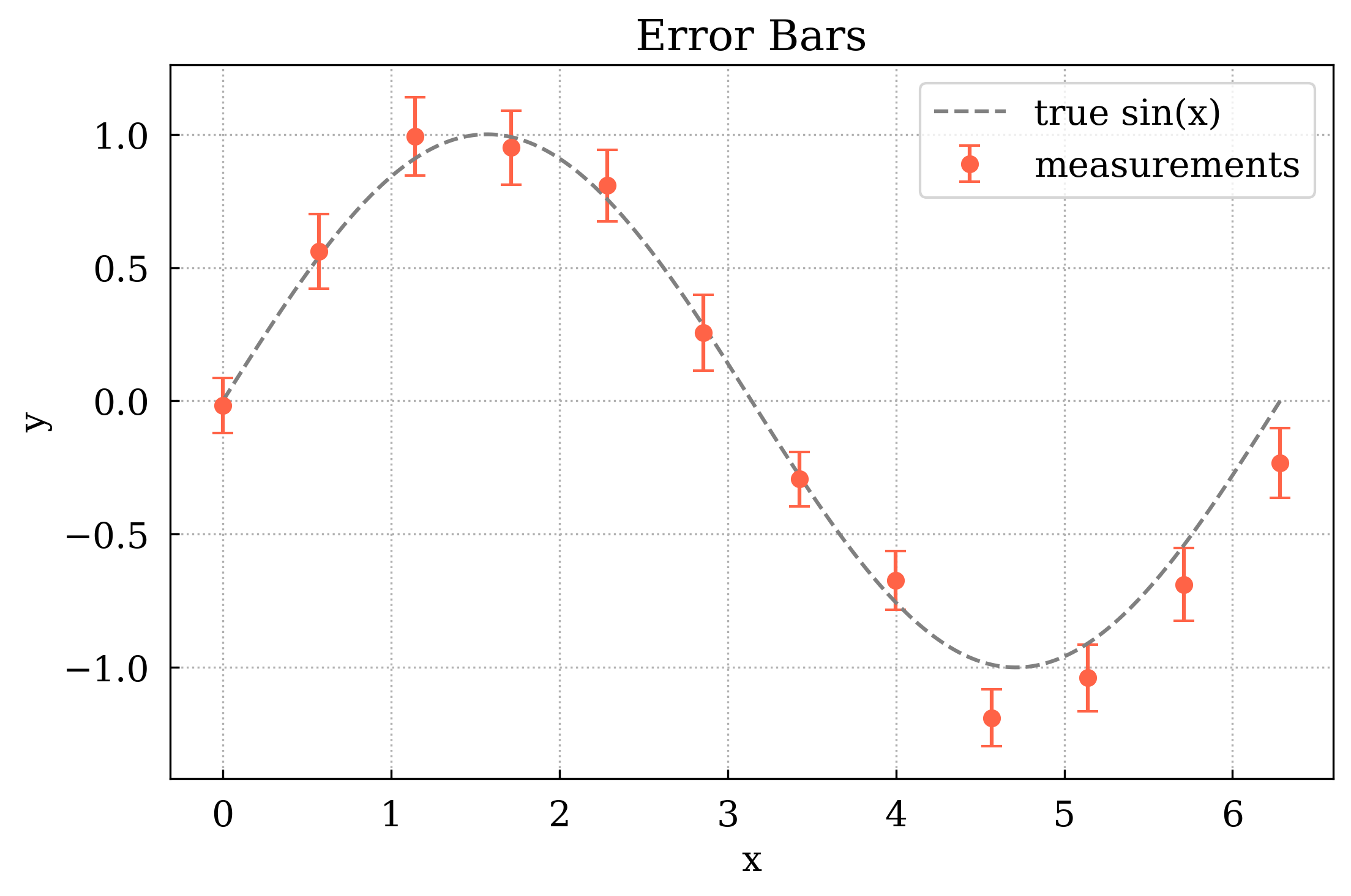
5 Error bars — ax.errorbar()
[7]:
xm = np.linspace(0, 2 * np.pi, 12)
ym = np.sin(xm) + rng.normal(0, 0.1, len(xm))
yerr = 0.1 + 0.05 * rng.random(len(xm))

canvas, ax = Canvas.subplots()
ax.errorbar(xm, ym, yerr=yerr, fmt="o", capsize=4, color="tomato", label="measurements")
ax.plot(x, np.sin(x), color="gray", linestyle="dashed", label="true sin(x)")
ax.set_xlabel("x")
ax.set_ylabel("y")
ax.set_title("Error Bars")
ax.set_legend(True)
ax.set_grid(True)
canvas.show(backend=BACKEND)
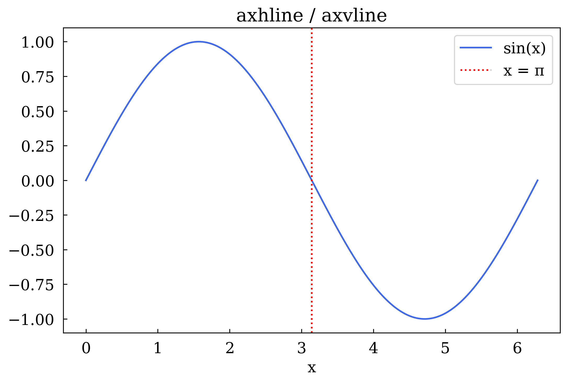
6 Reference lines — axhline and axvline
Span the entire axis to mark thresholds or zero-crossings.
[8]:
canvas, ax = Canvas.subplots()
ax.plot(x, np.sin(x), color="royalblue", label="sin(x)")

ax.axhline(y=0, color="black", linestyle="solid", linewidth=0.8)
ax.axhline(y=0.5, color="green", linestyle="dashed", linewidth=1.2, label="y = 0.5")
ax.axhline(y=-0.5, color="green", linestyle="dashed", linewidth=1.2, label="y = -0.5")
ax.axvline(x=np.pi, color="red", linestyle="dotted", linewidth=1.5, label="x = π")

ax.set_xlabel("x")
ax.set_title("axhline / axvline")
ax.set_legend(True)
canvas.show(backend=BACKEND)
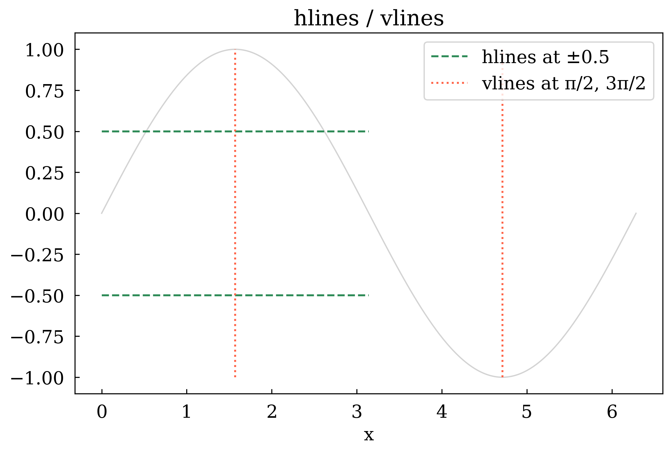
7 Segment lines — hlines and vlines
Draw multiple horizontal or vertical line segments with explicit start/end coordinates.
[9]:
canvas, ax = Canvas.subplots()
ax.plot(x, np.sin(x), color="lightgray", linewidth=1)

# Horizontal segments spanning half the x-range
ax.hlines(
    y=[0.5, -0.5],
    xmin=0,
    xmax=np.pi,
    colors="seagreen",
    linestyles="dashed",
    label="hlines at ±0.5",
)

# Vertical segments at specific x positions
ax.vlines(
    x=[np.pi / 2, 3 * np.pi / 2],
    ymin=-1,
    ymax=1,
    colors="tomato",
    linestyles="dotted",
    label="vlines at π/2, 3π/2",
)

ax.set_xlabel("x")
ax.set_title("hlines / vlines")
ax.set_legend(True)
canvas.show(backend=BACKEND)
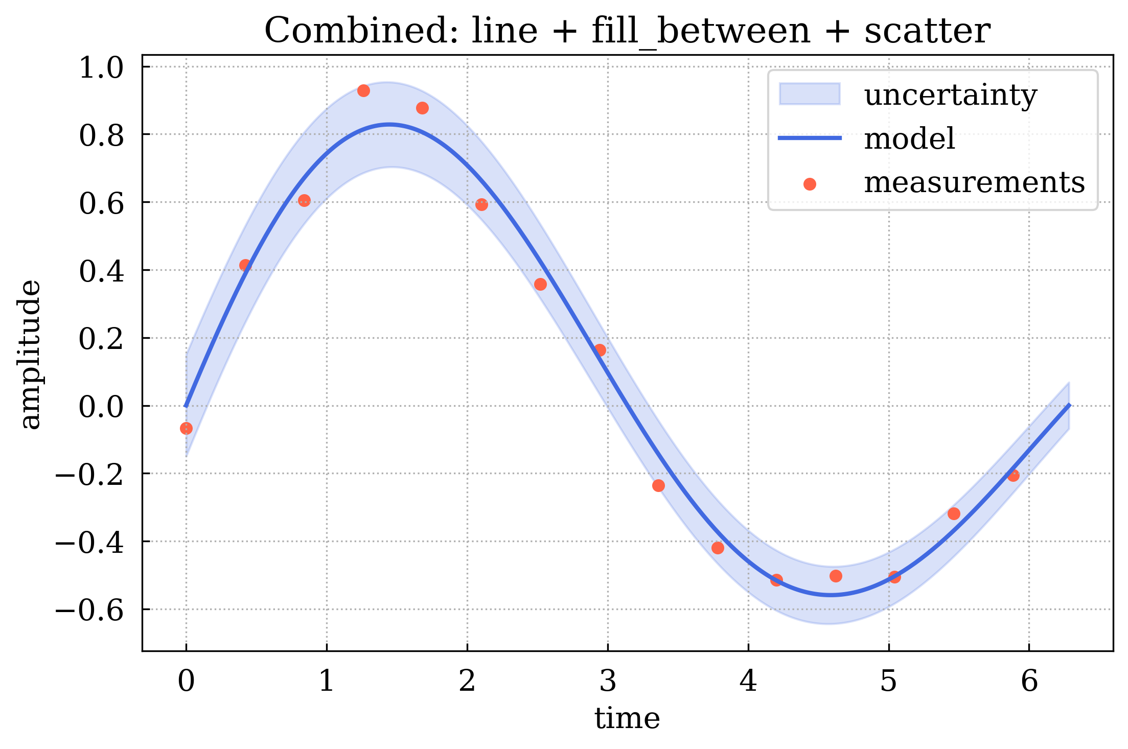
8 Combining plot types
A single subplot can hold many plot types simultaneously. Here we overlay a line, a shaded uncertainty band, and scatter points.
[10]:
t = np.linspace(0, 2 * np.pi, 300)
signal = np.sin(t) * np.exp(-t / 8)
noise = rng.normal(0, 0.08, len(t))
band = 0.15 * np.exp(-t / 8)

# Sparse measurement points
tidx = np.arange(0, len(t), 20)
tx, ty = t[tidx], (signal + noise)[tidx]

canvas, ax = Canvas.subplots()

ax.fill_between(
    t, signal - band, signal + band, alpha=0.2, color="royalblue", label="uncertainty"
)
ax.plot(t, signal, color="royalblue", linewidth=2, label="model")
ax.scatter(tx, ty, color="tomato", s=25, marker="o", label="measurements")
ax.axhline(y=0, color="gray", linestyle="dashed", linewidth=0.8)

ax.set_xlabel("time")
ax.set_ylabel("amplitude")
ax.set_title("Combined: line + fill_between + scatter")
ax.set_legend(True)
ax.set_grid(True)
canvas.show(backend=BACKEND)
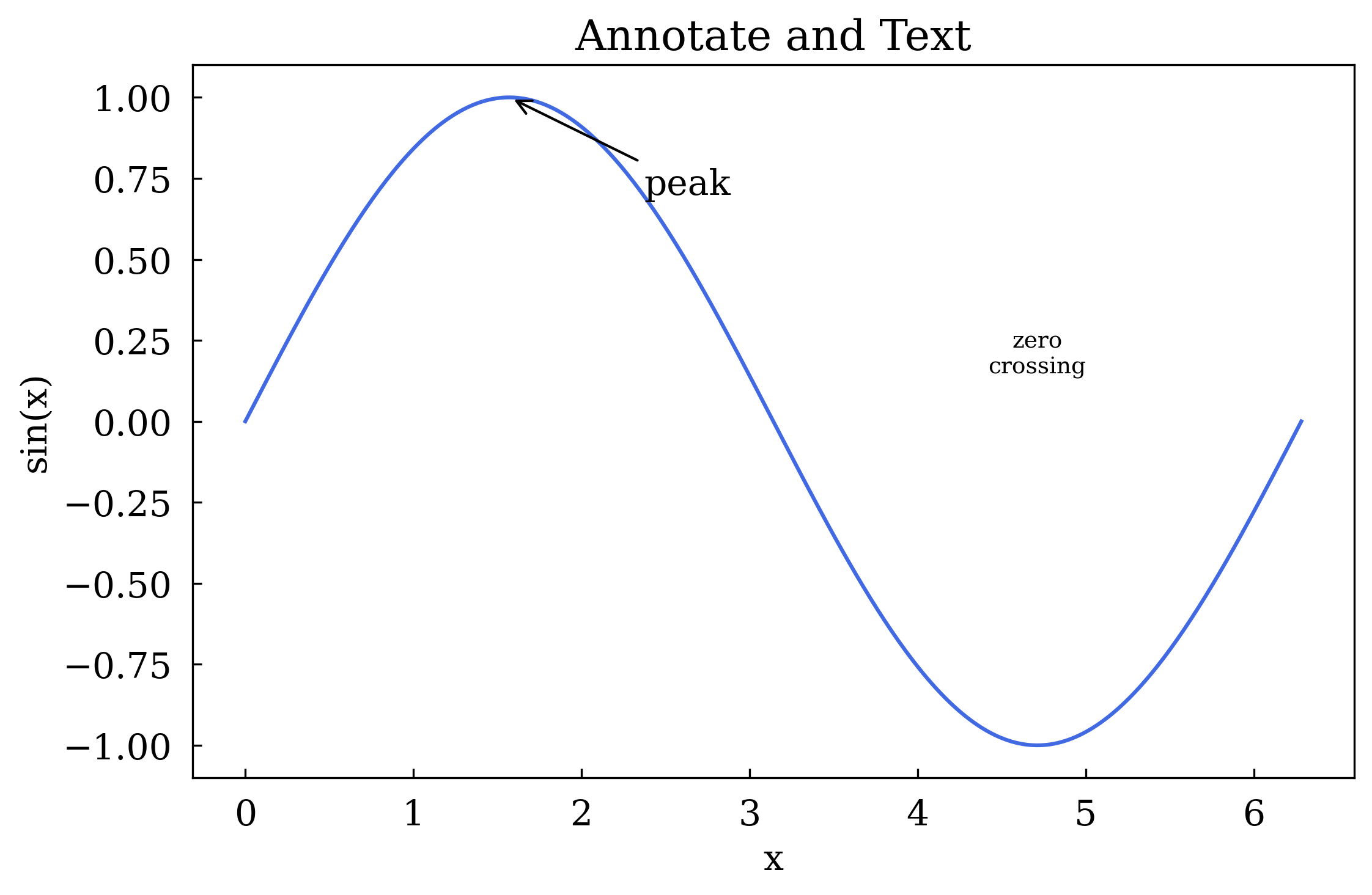
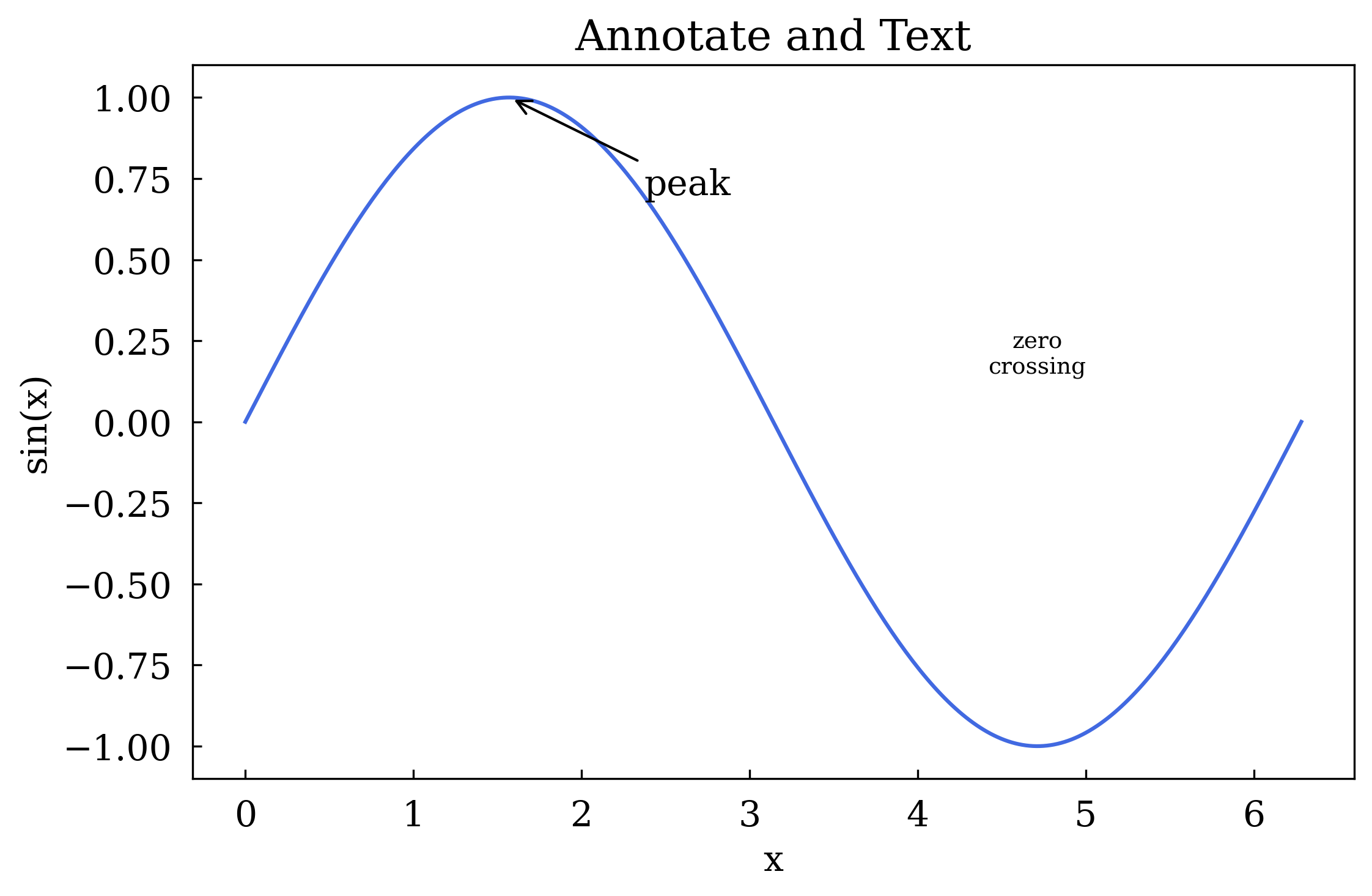
9 Annotations — ax.annotate() and ax.text()
[11]:
canvas, ax = Canvas.subplots()
ax.plot(x, np.sin(x), color="royalblue")

# Arrow annotation pointing to the peak
ax.annotate(
    "peak",
    xy=(np.pi / 2, 1.0),
    xytext=(np.pi / 2 + 0.8, 0.7),
    arrowprops=dict(arrowstyle="->"),
)

# Free-floating text label
ax.text(3 * np.pi / 2, 0.15, "zero\ncrossing", ha="center", fontsize=9)

ax.set_xlabel("x")
ax.set_ylabel("sin(x)")
ax.set_title("Annotate and Text")
canvas.show(backend=BACKEND)
Summary
Plot type |
Method |
Key kwargs |
|---|---|---|
Line |
|
|
Scatter |
|
|
Bar |
|
|
Filled band |
|
|
Error bars |
|
|
Full-span h/v line |
|
|
Segment lines |
|
|
Arrow annotation |
|
|
Free text |
|
|
You now know the full set of plot types available in maxplotlib. 🎉