Tutorial 05 – Axes, Ticks, Scales, and Annotations
This tutorial covers every way to control the coordinate frame of a subplot: labels, limits, tick marks, log scales, grids, legends, and annotations.
[1]:
from maxplotlib import Canvas
import numpy as np
Backend selection
All examples in this tutorial use the same Canvas API; you can switch rendering backends at any time:
BACKEND = "matplotlib"for static Matplotlib outputBACKEND = "plotly"for interactive Plotly output (Jupyter-friendly)
Most cells end with canvas.show(backend=BACKEND) so you can re-run the whole notebook with a different backend.
[2]:
# Change to "plotly" for interactive output
BACKEND = "matplotlib"
1 · Labels and title
LaTeX strings are supported in all text arguments.
[3]:
x = np.linspace(0, 2 * np.pi, 200)

canvas, ax = Canvas.subplots(width="10cm", ratio=0.55)
ax.plot(x, np.sin(x), color="steelblue")

ax.set_xlabel(r"$x$ (radians)")
ax.set_ylabel(r"$\sin(x)$")
ax.set_title(r"The sine function $f(x) = \sin(x)$")
canvas.show(backend=BACKEND)
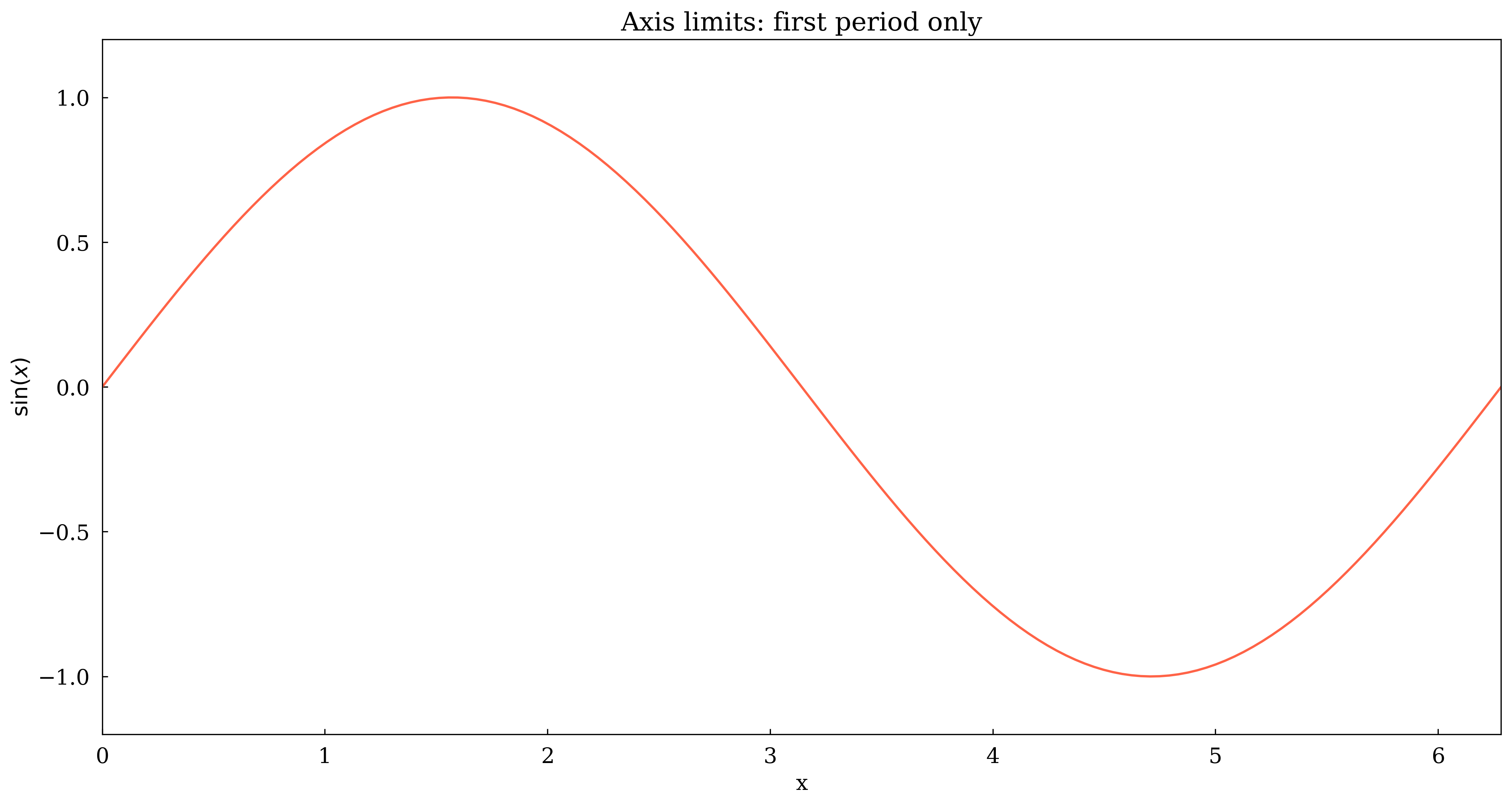
2 · Axis limits
[4]:
x = np.linspace(0, 4 * np.pi, 300)

canvas, ax = Canvas.subplots(width="10cm", ratio=0.5)
ax.plot(x, np.sin(x), color="tomato")

# Show only the first full period
ax.set_xlim(0, 2 * np.pi)
ax.set_ylim(-1.2, 1.2)

ax.set_xlabel("x")
ax.set_ylabel(r"$\sin(x)$")
ax.set_title("Axis limits: first period only")
canvas.show(backend=BACKEND)
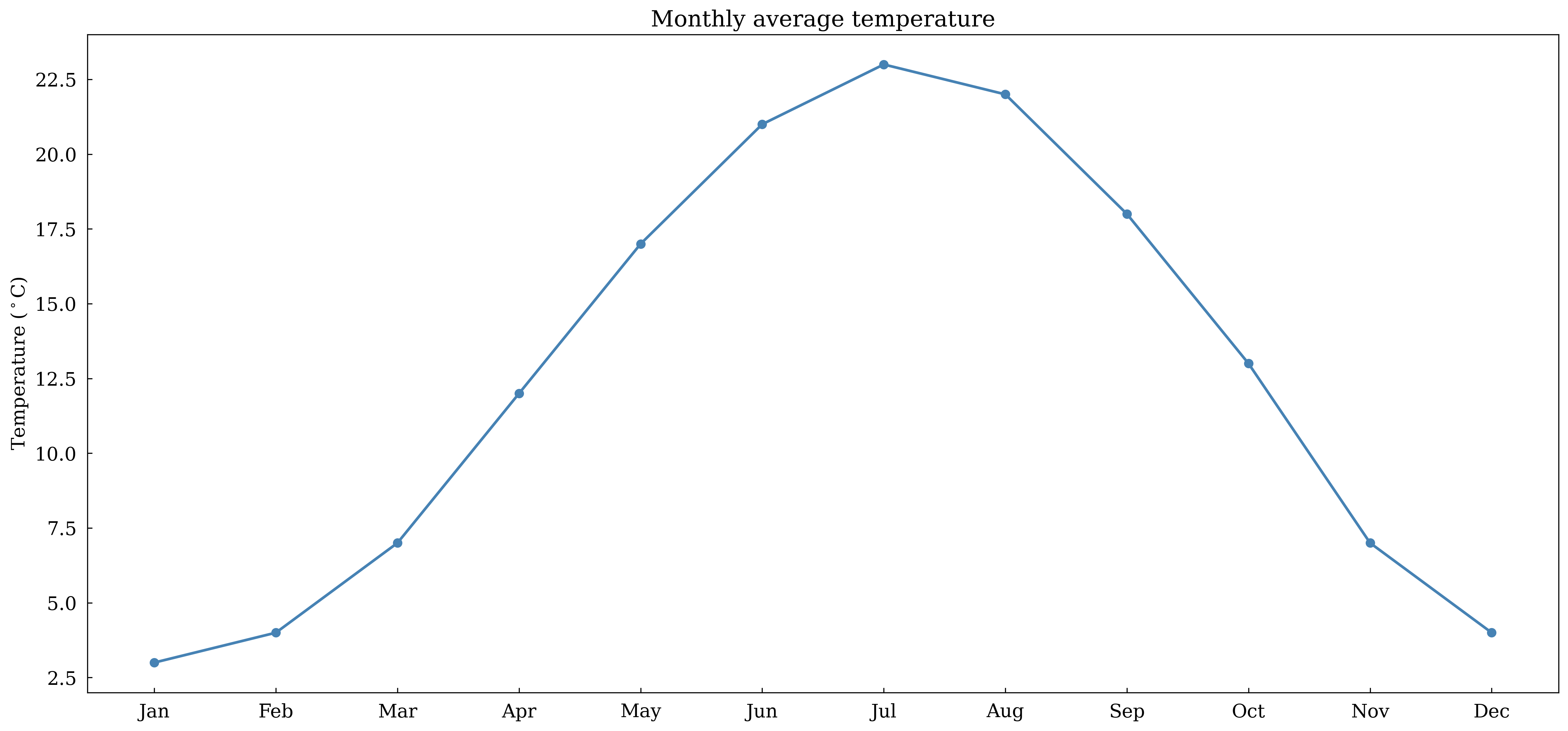
3 · Custom ticks
Pass tick positions and optional labels to set_xticks.
[5]:
months = [
    "Jan",
    "Feb",
    "Mar",
    "Apr",
    "May",
    "Jun",
    "Jul",
    "Aug",
    "Sep",
    "Oct",
    "Nov",
    "Dec",
]
temps = [3, 4, 7, 12, 17, 21, 23, 22, 18, 13, 7, 4]

canvas, ax = Canvas.subplots(width="12cm", ratio=0.45)
ax.plot(range(12), temps, marker="o", color="steelblue", linewidth=2)

ax.set_xticks(list(range(12)), labels=months)
ax.set_ylabel(r"Temperature ($^\circ$C)")
ax.set_title("Monthly average temperature")
canvas.show(backend=BACKEND)
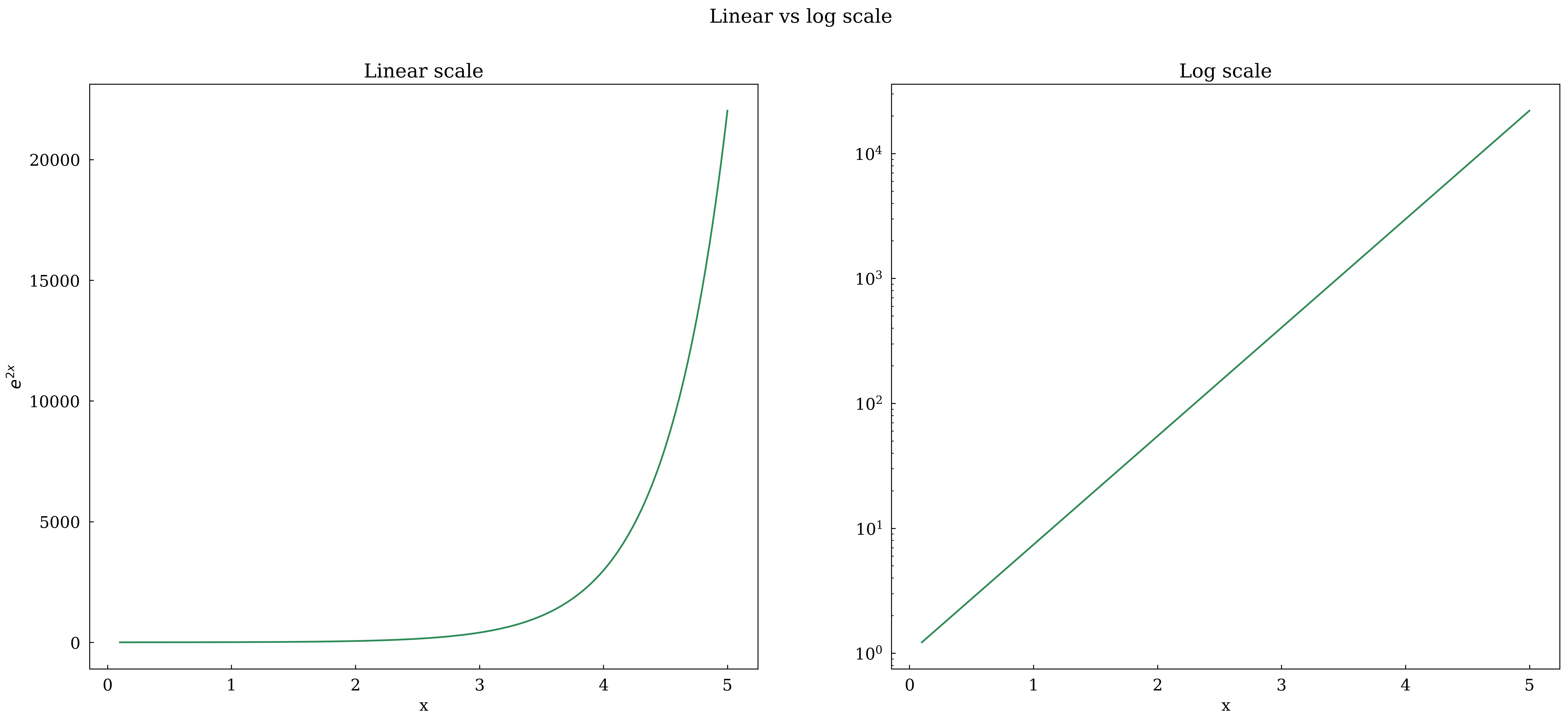
4 · Log scale
Use set_yscale('log') for data spanning several orders of magnitude. Compare linear and log in a 1×2 layout.
[6]:
x = np.linspace(0.1, 5, 200)
y = np.exp(2 * x)

canvas, (ax1, ax2) = Canvas.subplots(ncols=2, width="14cm", ratio=0.4)

ax1.plot(x, y, color="seagreen")
ax1.set_xlabel("x")
ax1.set_ylabel(r"$e^{2x}$")
ax1.set_title("Linear scale")

ax2.plot(x, y, color="seagreen")
ax2.set_xlabel("x")
ax2.set_yscale("log")
ax2.set_title("Log scale")

canvas.suptitle("Linear vs log scale")
canvas.show(backend=BACKEND)
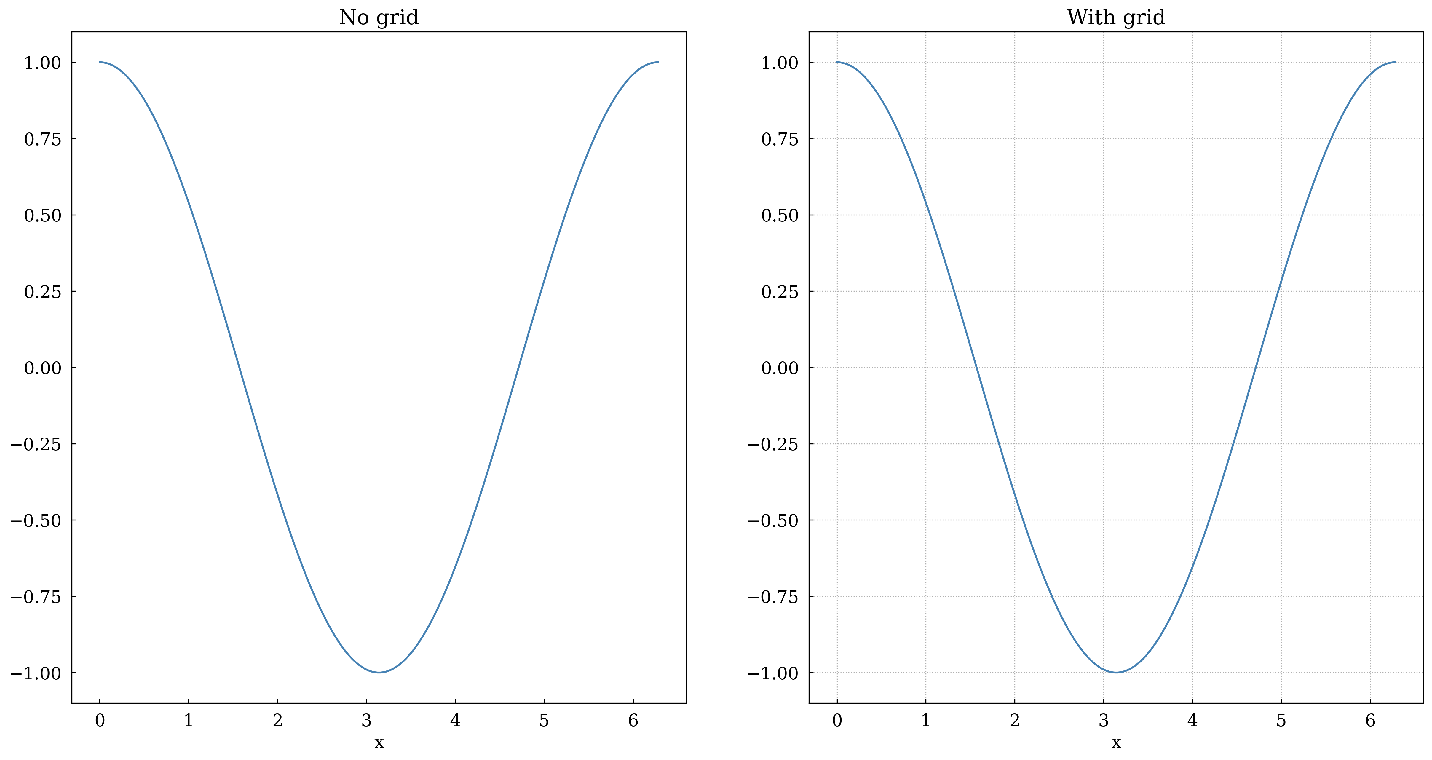
5 · Grid
[7]:
x = np.linspace(0, 2 * np.pi, 200)

canvas, (ax1, ax2) = Canvas.subplots(ncols=2, width="12cm", ratio=0.5)

ax1.plot(x, np.cos(x), color="steelblue")
ax1.set_title("No grid")
ax1.set_xlabel("x")

ax2.plot(x, np.cos(x), color="steelblue")
ax2.set_grid(True)
ax2.set_title("With grid")
ax2.set_xlabel("x")

canvas.show(backend=BACKEND)
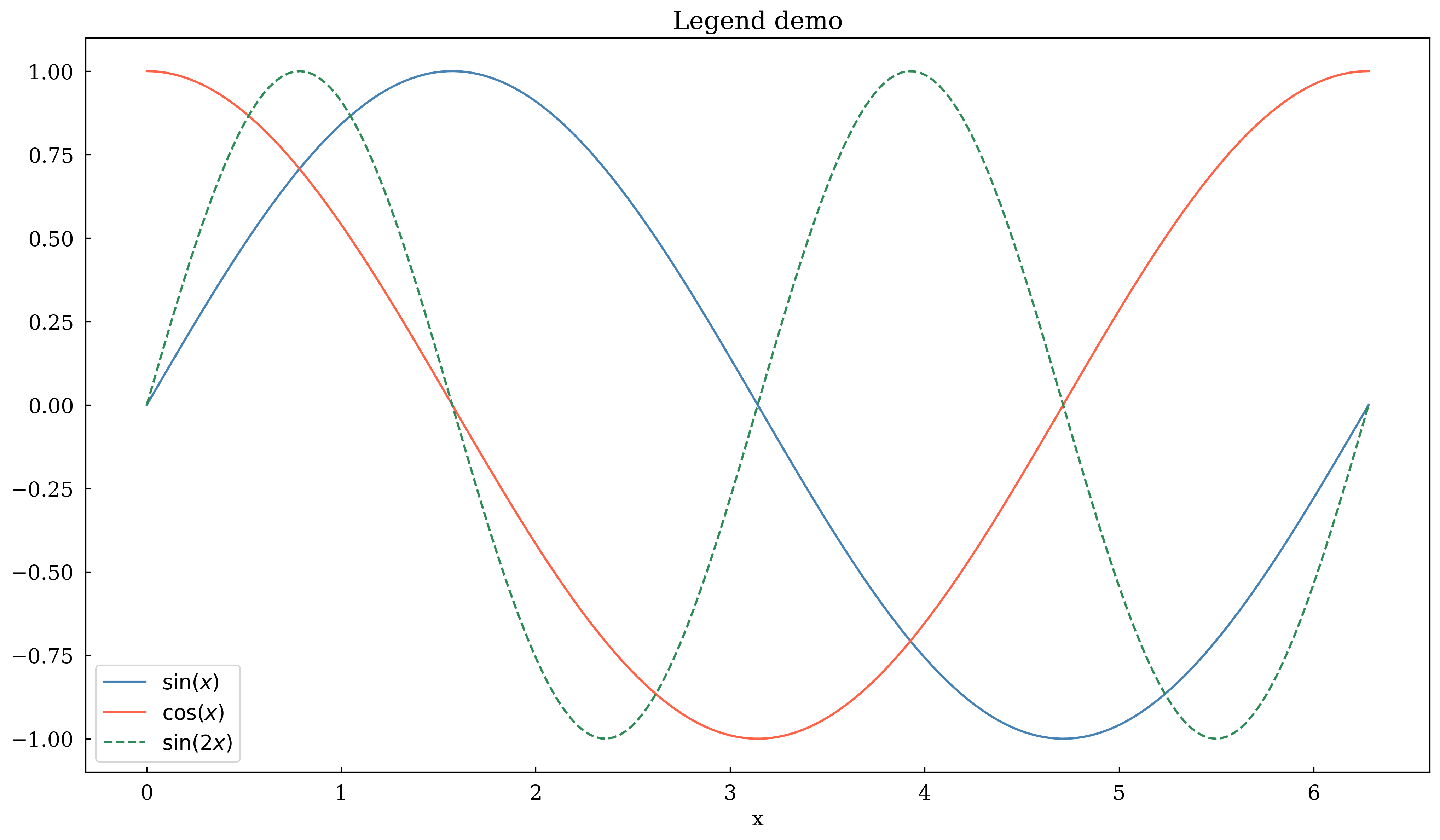
6 · Legend
Enable with set_legend(True). Labels come from label= kwargs.
[8]:
x = np.linspace(0, 2 * np.pi, 200)

canvas, ax = Canvas.subplots(width="10cm", ratio=0.55)
ax.plot(x, np.sin(x), color="steelblue", label=r"$\sin(x)$")
ax.plot(x, np.cos(x), color="tomato", label=r"$\cos(x)$")
ax.plot(x, np.sin(2 * x), color="seagreen", label=r"$\sin(2x)$", linestyle="dashed")

ax.set_xlabel("x")
ax.set_legend(True)
ax.set_title("Legend demo")
canvas.show(backend=BACKEND)
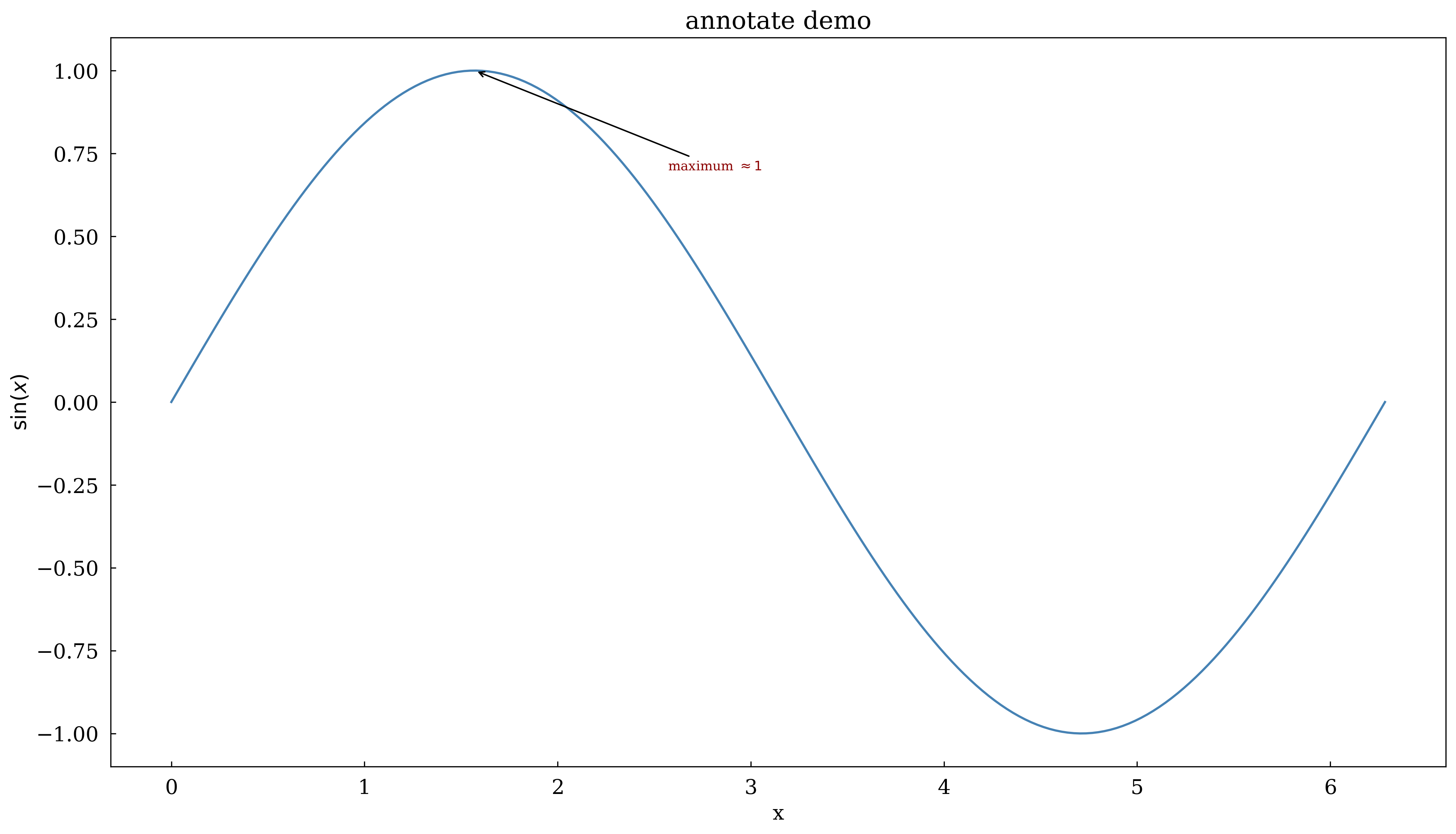
7 · annotate
Draw an arrow from a text label to a data point.
[9]:
x = np.linspace(0, 2 * np.pi, 200)
y = np.sin(x)

canvas, ax = Canvas.subplots(width="10cm", ratio=0.55)
ax.plot(x, y, color="steelblue")

# Annotate the maximum
ax.annotate(
    r"maximum $\approx 1$",
    xy=(np.pi / 2, 1.0),
    xytext=(np.pi / 2 + 1.0, 0.7),
    arrowprops=dict(arrowstyle="->", color="black"),
    fontsize=9,
    color="darkred",
)

ax.set_xlabel("x")
ax.set_ylabel(r"$\sin(x)$")
ax.set_title("annotate demo")
canvas.show(backend=BACKEND)
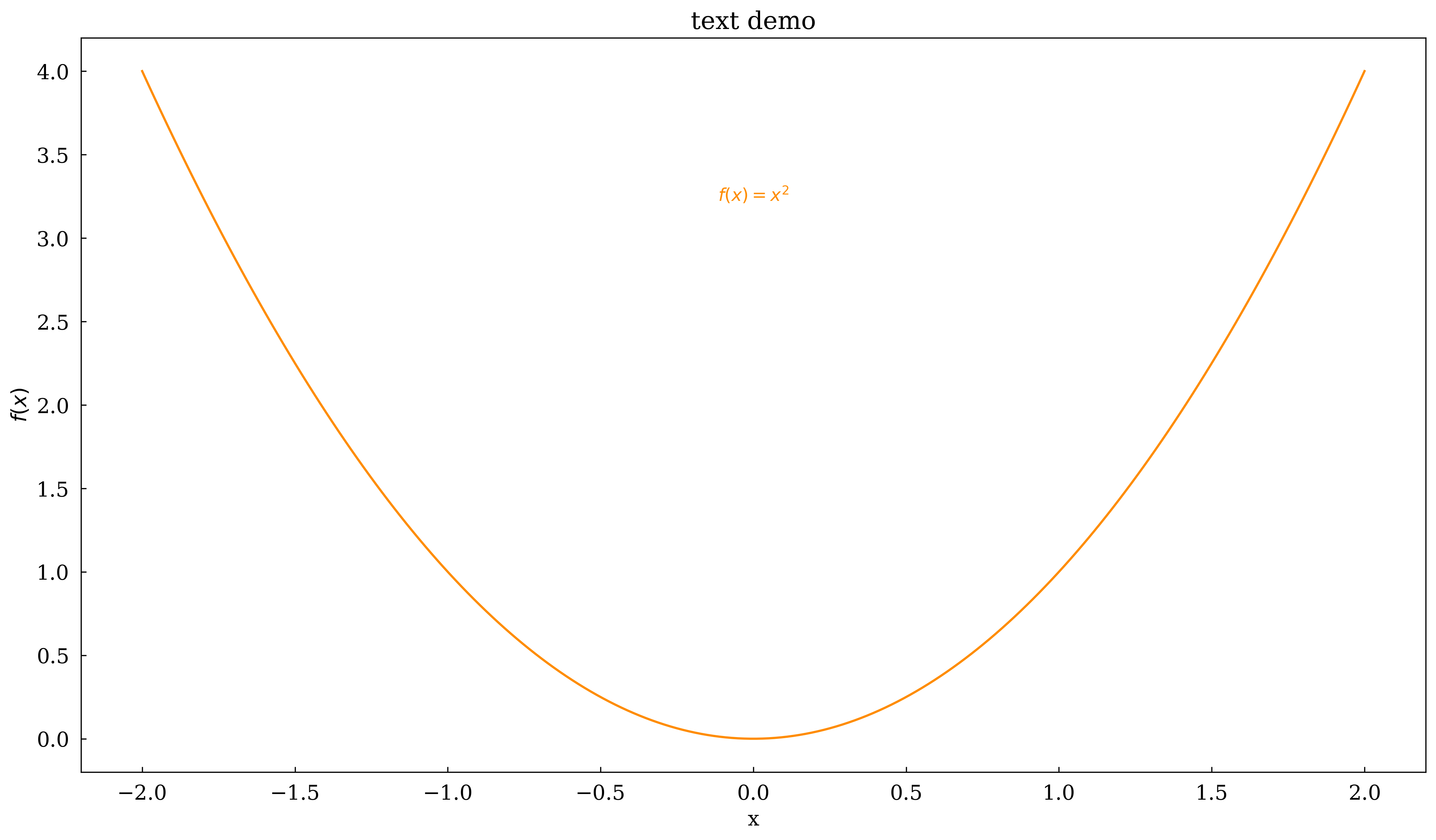
8 · text
Place a text label at arbitrary data coordinates.
[10]:
x = np.linspace(-2, 2, 200)

canvas, ax = Canvas.subplots(width="10cm", ratio=0.55)
ax.plot(x, x**2, color="darkorange")

ax.text(
    0, 3.2, r"$f(x) = x^2$", ha="center", va="bottom", fontsize=12, color="darkorange"
)

ax.set_xlabel("x")
ax.set_ylabel(r"$f(x)$")
ax.set_title("text demo")
canvas.show(backend=BACKEND)

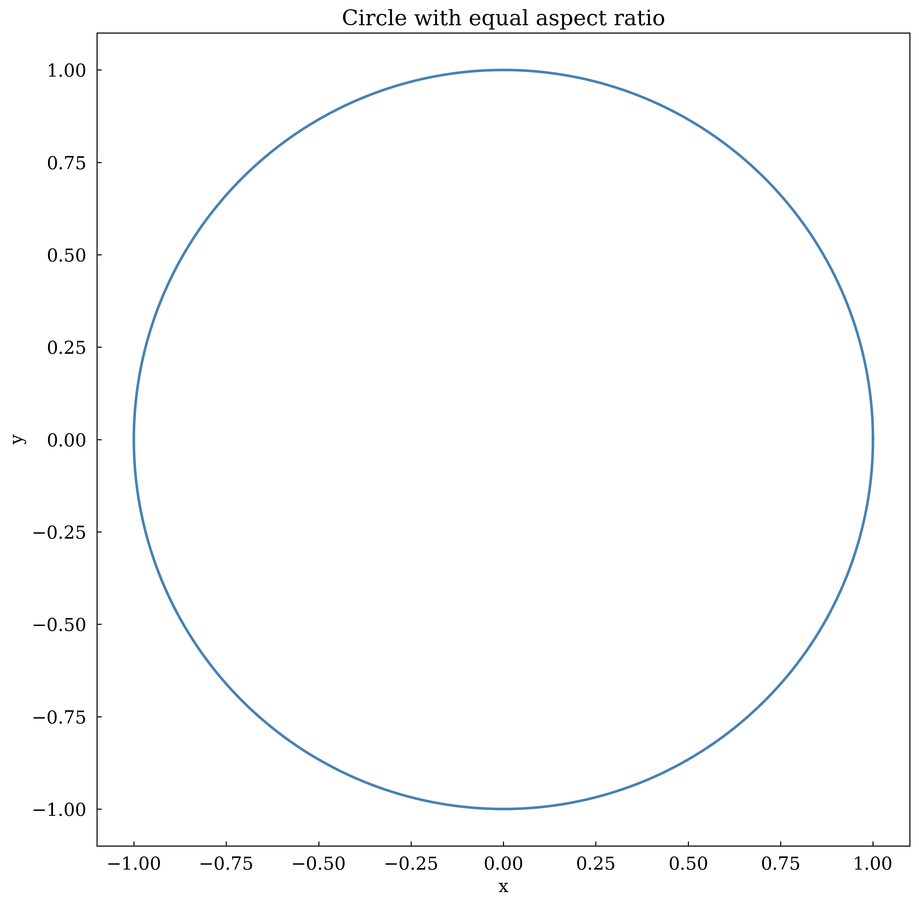
9 · Aspect ratio
set_aspect('equal') ensures a circle looks circular.
[11]:
theta = np.linspace(0, 2 * np.pi, 300)

canvas, ax = Canvas.subplots(width="7cm", ratio=1.0)
ax.plot(np.cos(theta), np.sin(theta), color="steelblue", linewidth=2)
ax.set_aspect("equal")
ax.set_title("Circle with equal aspect ratio")
ax.set_xlabel("x")
ax.set_ylabel("y")
canvas.show(backend=BACKEND)
Summary
Method |
Purpose |
|---|---|
|
Axis labels (LaTeX OK) |
|
Subplot title |
|
Axis range |
|
Custom tick marks |
|
Logarithmic scale |
|
Background grid |
|
Auto legend |
|
Arrow annotation |
|
Free text label |
|
Equal x/y scaling |