6. Building your own plots#
Install for this tutorial:
pip install "scope-profiler[pproc]".
The built-in charts (notebook 3) cover the usual questions. When yours
is different, the data is one call away — this notebook draws five
charts with plain matplotlib on top of events() and call_stack().
Requires matplotlib and pandas, both part of the pproc extra:
pip install "scope-profiler[pproc]"
import random
import tempfile
import time
from pathlib import Path

import matplotlib.pyplot as plt

from scope_profiler import ProfileManager, read_h5

WORKDIR = Path(tempfile.mkdtemp(prefix="scope-profiler-tutorial-"))


def run(file_path, solve_cost, seed=0):
    """Record a run: a setup phase, then timesteps whose solve slows down."""
    jitter = random.Random(seed)  # seeded, so the notebook reproduces
    ProfileManager.setup(file_path=str(file_path))

    with ProfileManager.region("setup"):
        time.sleep(0.02)

    for step in range(24):
        with ProfileManager.region("timestep"):
            with ProfileManager.region("assemble"):
                time.sleep(0.002 + jitter.uniform(0, 0.0006))
            with ProfileManager.region("solve"):
                time.sleep(solve_cost + 0.00008 * step + jitter.uniform(0, 0.0012))
        if step % 8 == 7:
            with ProfileManager.region("checkpoint"):
                time.sleep(0.006)

    ProfileManager.finalize(verbose=False)
    return read_h5(file_path)


results = run(WORKDIR / "run_a.h5", solve_cost=0.003)
# Charts frame the x axis on the first region entry, so measure the events
# from there too (the default is the run's start time, recorded by setup()).
frame = results.to_events_dataframe(origin=results.minimum_start_time)
frame.head()
name |
rank |
call_index |
start |
end |
duration |
|
|---|---|---|---|---|---|---|
0 |
setup |
0 |
0 |
0.000000 |
0.020085 |
0.020085 |
1 |
timestep |
0 |
0 |
0.020242 |
0.027005 |
0.006762 |
2 |
timestep |
0 |
1 |
0.027009 |
0.032812 |
0.005803 |
3 |
timestep |
0 |
2 |
0.032815 |
0.038923 |
0.006108 |
4 |
timestep |
0 |
3 |
0.038926 |
0.045155 |
0.006229 |
A house style#
Two habits make a set of charts readable as a set:
One colour per region, fixed. Assign colours by name, not by position, so a region keeps its colour when a filter changes which regions are on screen.
Recede everything that is not data — thin gridlines, no box around the plot, muted tick labels.
The palette below is colourblind-safe; the helper applies the rest.
# Fixed categorical palette, assigned in order and never cycled.
PALETTE = ["#2a78d6", "#eb6834", "#1baf7a", "#eda100", "#e87ba4"]
REGION_COLOR = {
    name: PALETTE[index % len(PALETTE)]
    for index, name in enumerate(sorted(results.region_names))
}

MUTED = "#898781"
GRID = "#e1e0d9"


def style(ax, xlabel=None, ylabel=None, title=None, grid_axis="y"):
    """Push the chrome into the background so the data reads first."""
    ax.set_axisbelow(True)
    ax.grid(axis=grid_axis, color=GRID, linewidth=0.8)
    for side in ("top", "right"):
        ax.spines[side].set_visible(False)
    for side in ("left", "bottom"):
        ax.spines[side].set_color(GRID)
    ax.tick_params(colors=MUTED, length=0)
    if xlabel:
        ax.set_xlabel(xlabel, color=MUTED)
    if ylabel:
        ax.set_ylabel(ylabel, color=MUTED)
    if title:
        ax.set_title(title, loc="left", fontweight="bold")
    return ax


REGION_COLOR
{'assemble': '#2a78d6',
 'checkpoint': '#eb6834',
 'setup': '#1baf7a',
 'solve': '#eda100',
 'timestep': '#e87ba4'}
1. A timeline of the run#
events() gives every call a start and an end on a zero-based timeline,
which is exactly what broken_barh wants. One lane per region, and the
nesting is visible as bars stacked in time.
regions = [region.name for region in results.get_regions()]

fig, ax = plt.subplots(figsize=(10, 3.2))

for lane, name in enumerate(regions):
    events = results.events(include=f"^{name}$", origin=results.minimum_start_time)
    spans = [(event["start"], event["duration"]) for event in events]
    ax.broken_barh(spans, (lane - 0.35, 0.7), facecolors=REGION_COLOR[name])

ax.set_yticks(range(len(regions)), regions)
ax.set_xlim(0, results.time_span)
style(ax, xlabel="time since first region entry [s]", grid_axis="x")
ax.set_title("Timeline of a single run", loc="left", fontweight="bold")
plt.tight_layout()
plt.show()
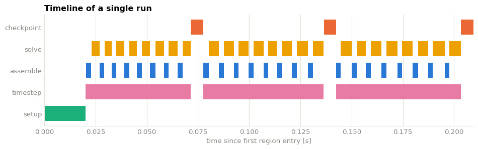
include uses re.match, so "solve" would also match
"solver_setup" — hence the anchored ^...$ pattern when you want
exactly one region.
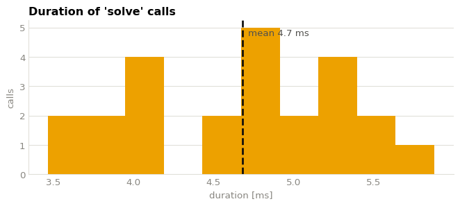
2. How long does a call take?#
For a region entered many times, the distribution says more than the mean: a long tail means a few slow calls, a wide spread means something is unstable. A single series needs no legend — the title names it.
durations = frame.query("name == 'solve'")["duration"] * 1e3

fig, ax = plt.subplots(figsize=(7, 3.2))
ax.hist(durations, bins=10, color=REGION_COLOR["solve"])
ax.axvline(durations.mean(), color="#0b0b0b", linewidth=2, linestyle="--")
ax.annotate(
    f"mean {durations.mean():.1f} ms",
    (durations.mean(), ax.get_ylim()[1] * 0.9),
    xytext=(6, 0),
    textcoords="offset points",
    color="#52514e",
)

style(ax, xlabel="duration [ms]", ylabel="calls", title="Duration of 'solve' calls")
plt.tight_layout()
plt.show()
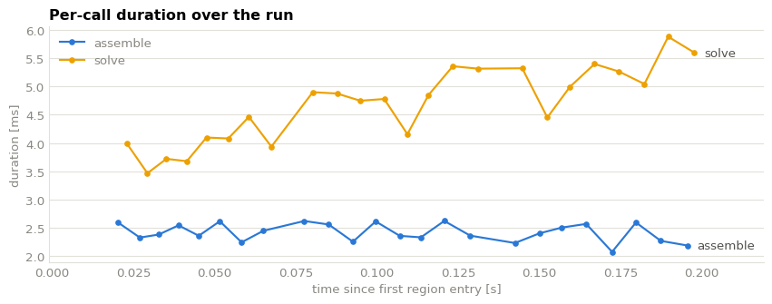
3. Does it drift over the run?#
Plotting duration against start time catches the things an average
hides: a solve that degrades as the simulation progresses, a cache
warming up, memory filling. Here solve is deliberately getting slower.
fig, ax = plt.subplots(figsize=(9, 3.6))

for name in ["assemble", "solve"]:
    calls = frame[frame["name"] == name]
    ax.plot(
        calls["start"],
        calls["duration"] * 1e3,
        marker="o",
        markersize=4,
        linewidth=1.6,
        color=REGION_COLOR[name],
        label=name,
    )
    # Direct label at the end of the line, so identity is never colour alone.
    last = calls.iloc[-1]
    ax.annotate(
        name,
        (last["start"], last["duration"] * 1e3),
        xytext=(8, 0),
        textcoords="offset points",
        color="#52514e",
        va="center",
    )

ax.legend(frameon=False, labelcolor=MUTED)
ax.margins(x=0.12)
style(
    ax,
    xlabel="time since first region entry [s]",
    ylabel="duration [ms]",
    title="Per-call duration over the run",
)
plt.tight_layout()
plt.show()
4. Where did the time go?#
Total time per region answers “what should I optimise” — but only once
nested time is separated out. total counts everything inside a region;
self (exclusive) time removes what its children spent, and that is the
number worth ranking by. Notebook 5 derives both from call_stack();
the same few lines appear here.
from collections import defaultdict

from scope_profiler import call_stack_children

calls = results.call_stack(rank=0, origin=results.minimum_start_time)
children = call_stack_children(calls)

total = defaultdict(float)
exclusive = defaultdict(float)
for index, call in enumerate(calls):
    nested = sum(calls[child]["duration"] for child in children[index])
    total[call["name"]] += call["duration"]
    exclusive[call["name"]] += call["duration"] - nested

order = sorted(total, key=exclusive.get)
positions = range(len(order))

fig, ax = plt.subplots(figsize=(8, 3.4))
ax.barh(
    [p + 0.2 for p in positions],
    [total[n] for n in order],
    height=0.36,
    color="#9ec5f4",
    label="total (with nested)",
)
ax.barh(
    [p - 0.2 for p in positions],
    [exclusive[n] for n in order],
    height=0.36,
    color="#2a78d6",
    label="self (exclusive)",
)

for position, name in zip(positions, order):
    ax.annotate(
        f"{exclusive[name] * 1e3:.0f} ms",
        (exclusive[name], position - 0.2),
        xytext=(6, 0),
        textcoords="offset points",
        va="center",
        color="#52514e",
    )

ax.set_yticks(list(positions), order)
ax.legend(frameon=False, labelcolor=MUTED, loc="upper right")
style(ax, xlabel="time [s]", title="Total vs self time per region", grid_axis="x")
plt.tight_layout()
plt.show()
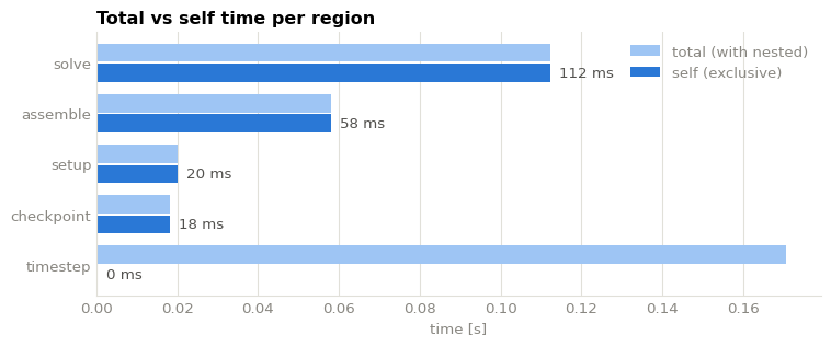
timestep is almost entirely nested time — it is a container, not work.
The bars that stay long in the dark series are the real hotspots.
5. Your own flame graph#
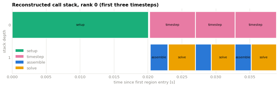
call_stack() returns each call with a depth and its parent’s index,
so drawing a flame graph is a rectangle per call: time on the x-axis,
depth on the y-axis. This is what plot_flame() does; twenty lines of
matplotlib get you a version you control.
Twenty-four timesteps do not fit legibly side by side, so this one zooms into a window - the calls are plain dicts, so narrowing the run down to an interesting interval is a list comprehension.
from matplotlib.patches import Patch

# Zoom into the setup plus the first three timesteps.
timesteps = results.events(include="^timestep$", origin=results.minimum_start_time)
window_end = timesteps[2]["end"]
window = [call for call in calls if call["start"] < window_end]

fig, ax = plt.subplots(figsize=(10, 3.2))

for call in window:
    ax.barh(
        call["depth"],
        call["duration"],
        left=call["start"],
        height=0.82,
        color=REGION_COLOR[call["name"]],
        edgecolor="#fcfcfb",  # a small surface gap keeps adjacent calls apart
        linewidth=2,
    )
    # Label only the calls wide enough to hold the text.
    if call["duration"] > 0.06 * window_end:
        ax.annotate(
            call["name"],
            (call["start"] + call["duration"] / 2, call["depth"]),
            ha="center",
            va="center",
            fontsize=8,
            color="#0b0b0b",
        )

# The narrow calls have no room for a label, so name the colours instead.
present = dict.fromkeys(call["name"] for call in window)
ax.legend(
    handles=[Patch(facecolor=REGION_COLOR[name], label=name) for name in present],
    frameon=False,
    labelcolor=MUTED,
    loc="lower left",
)

ax.set_xlim(0, window_end)
ax.set_yticks(range(max(call["depth"] for call in window) + 1))
ax.invert_yaxis()
style(
    ax,
    xlabel="time since first region entry [s]",
    ylabel="stack depth",
    title="Reconstructed call stack, rank 0 (first three timesteps)",
    grid_axis="x",
)
plt.tight_layout()
plt.show()
6. Comparing two runs#
Readers are cheap and independent, so a comparison is just two DataFrames with a label column. Colour follows the run here, since that is what the chart is about.
import pandas as pd

reader_b = run(WORKDIR / "run_b.h5", solve_cost=0.005, seed=1)

comparison = pd.concat(
    [
        results.to_dataframe().assign(run="baseline"),
        reader_b.to_dataframe().assign(run="slower solve"),
    ]
)
totals = comparison.pivot_table(index="name", columns="run", values="total_duration")
totals
run |
baseline |
slower solve |
|---|---|---|
name |
||
assemble |
0.058098 |
0.056964 |
checkpoint |
0.018231 |
0.018227 |
setup |
0.020085 |
0.020078 |
solve |
0.112360 |
0.156337 |
timestep |
0.170759 |
0.213618 |
RUN_COLOR = {"baseline": "#2a78d6", "slower solve": "#eb6834"}

positions = range(len(totals))
fig, ax = plt.subplots(figsize=(8, 3.4))

for offset, run_name in zip((-0.2, 0.2), totals.columns):
    ax.bar(
        [p + offset for p in positions],
        totals[run_name],
        width=0.36,
        color=RUN_COLOR[run_name],
        label=run_name,
    )

ax.set_xticks(list(positions), totals.index)
ax.legend(frameon=False, labelcolor=MUTED)
style(ax, ylabel="total time [s]", title="Total time per region, two runs")
plt.tight_layout()
plt.show()
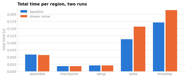
The built-in plot_durations() and plot_speedup() do this for you
across any number of files, and
scope-profiler plot quick run_a.h5 run_b.h5 -o figures/ does it
without any code at all. Reach for the custom route when the question is
yours rather than theirs.
Where to go next#
3. Visualizing results — the built-in charts and their options.
5. Custom analysis — the data behind these plots.
scope-profiler plot listandscope-profiler plot durations --help— the same charts from the command line.