3. Visualizing results#
Install for this tutorial:
pip install "scope-profiler[pproc]".
scope-profiler ships a growing set of chart types, all built on
maxplotlib:
function |
answers |
|---|---|
|
when did each call happen, on which rank? |
|
how does time break down across nested regions? |
|
which regions cost the most (total / avg / min / max)? |
|
how does a region scale with ranks or threads? |
|
does runtime stay constant as the workload scales? |
They need the pproc extra:
pip install "scope-profiler[pproc]"
Every function takes a results (or a list of runs), include /
exclude filters, a filepath to save to, show=True to display, and
a backend of either "matplotlib" (default) or "plotly"
(interactive).
import tempfile
import time
from pathlib import Path

from scope_profiler import ProfileManager, read_h5

WORKDIR = Path(tempfile.mkdtemp(prefix="scope-profiler-tutorial-"))
DATA_FILE = WORKDIR / "profiling_data.h5"

ProfileManager.setup(file_path=str(DATA_FILE))

with ProfileManager.region("setup"):
    time.sleep(0.02)

for step in range(4):
    with ProfileManager.region("timestep"):
        with ProfileManager.region("assemble"):
            time.sleep(0.006)
        with ProfileManager.region("solve"):
            time.sleep(0.010)
        with ProfileManager.region("output"):
            time.sleep(0.002)

ProfileManager.finalize(verbose=False)
results = read_h5(DATA_FILE)
results.print_summary()
  ╭─────────────────────────────────╮
  │ region              total [s]   │
  ├─────────────────────────────────┤
  │ setup               0.020082    │
  │ timestep (4x)       0.073190    │
  │ └─ (own)               0.000301 │
  │ └─ assemble (4x)       0.024301 │
  │ └─ solve (4x)          0.040299 │
  │ └─ output (4x)         0.008290 │
  ╰─────────────────────────────────╯

  ╭─ Info ──────────────────────────────────────────────────────────────────────────────────────────────────────────────────────────╮
  │ Summary: ../../../../../../tmp/scope-profiler-tutorial-b_4gvaky/profiling_data.h5 (1 rank)                                      │
  │                                                                                                                                 │
  │ Explore:                                                                                                                        │
  │   Inspect: scope-profiler inspect ../../../../../../tmp/scope-profiler-tutorial-b_4gvaky/profiling_data.h5                      │
  │   TUI:     scope-profiler tui ../../../../../../tmp/scope-profiler-tutorial-b_4gvaky/profiling_data.h5                          │
  │                                                                                                                                 │
  │ Visualize and export:                                                                                                           │
  │   Plot:    scope-profiler plot default ../../../../../../tmp/scope-profiler-tutorial-b_4gvaky/profiling_data.h5 -o plots --show │
  │   Report:  scope-profiler report ../../../../../../tmp/scope-profiler-tutorial-b_4gvaky/profiling_data.h5 -o report.html        │
  │   Export:  scope-profiler export plot-data ../../../../../../tmp/scope-profiler-tutorial-b_4gvaky/profiling_data.h5 -o data     │
  │   Lines:   scope-profiler line-profile ../../../../../../tmp/scope-profiler-tutorial-b_4gvaky/profiling_data.h5                 │
  │                                                                                                                                 │
  │ Compare runs:                                                                                                                   │
  │   Diff:    scope-profiler diff BASE.h5 CANDIDATE.h5                                                                             │
  │   Check:   scope-profiler check BASE.h5 CANDIDATE.h5                                                                            │
  │                                                                                                                                 │
  │ Durations are in seconds.                                                                                                       │
  │ Regions may nest, so the summed total can exceed the wall-clock time.                                                           │
  ╰─────────────────────────────────────────────────────────────────────────────────────────────────────────────────────────────────╯
In a notebook, pass show=True to display each chart directly. You can
still pass filepath when you also want to save a chart. (PNG export
with the default matplotlib backend needs nothing extra; the plotly
backend writes self-contained .html, or .png if kaleido is
installed.)
from scope_profiler import plot_durations, plot_flame, plot_gantt
Gantt chart — what ran when#
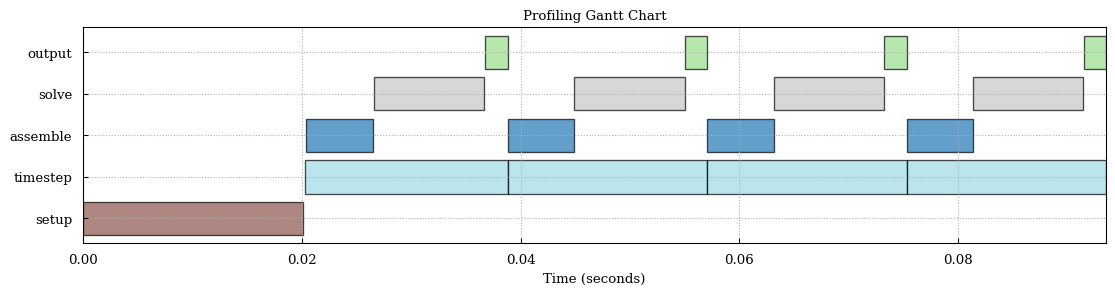
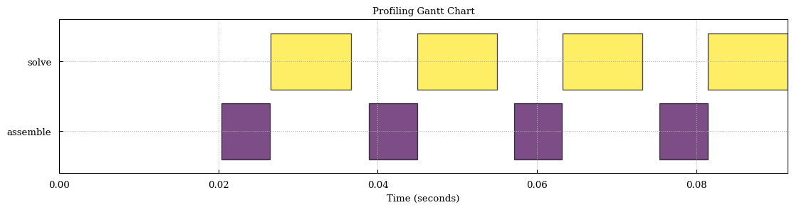
Each call becomes a bar on a timeline, with one lane per rank. This is the chart for spotting gaps, stragglers and serialization.
plot_gantt(results, show=True, verbose=False)
Flame chart — where the time goes#
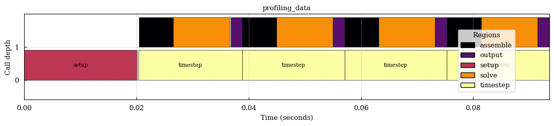
The flame chart reconstructs the nesting from the timestamps: a region
drawn on top of another ran inside it. It covers rank 0 by default,
since it represents a single execution’s call stack; pass ranks=[...]
for one chart per rank.
plot_flame(results, show=True, verbose=False)
Duration charts — which region is expensive#
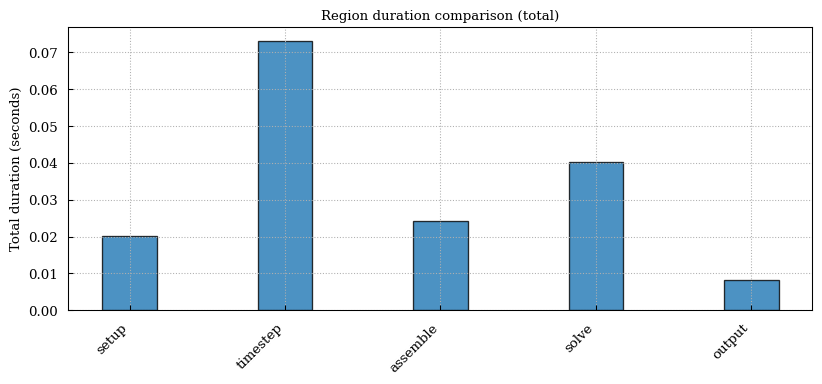
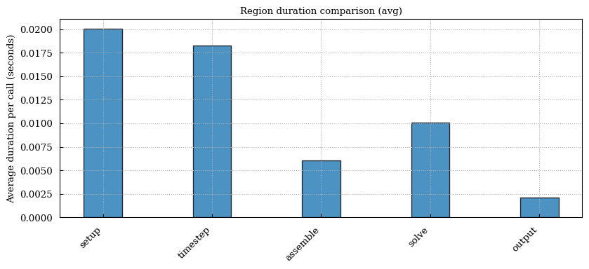
plot_durations draws one bar chart per metric. By default it produces
all of total, avg, min and max, writing one file per metric and
returning the path it wrote; pass metric= to choose the statistic.
plot_durations(results, metric="total", show=True, verbose=False)
plot_durations(results, metric="avg", show=True, verbose=False)
Filtering and colors#
include / exclude are regexes matched against region names, and
cmap picks any matplotlib
colormap.
Region colors are consistent across chart types, so a region keeps its
color between the Gantt and flame views.
plot_gantt(
    results,
    include=["solve", "assemble"],
    cmap="viridis",
    show=True,
    verbose=False,
)
Speedup charts#
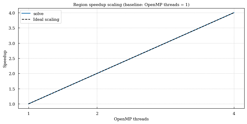
plot_speedup compares the same region across several files and plots
speedup against a metadata field — num_ranks (default),
omp_num_threads or total_cores. It needs at least two files, so it
is normally fed a scaling study:
runs = [read_h5(f"run_{n}ranks.h5") for n in (1, 2, 4, 8)]
plot_speedup(runs, x_field="num_ranks", filepath="speedup.png")
To keep this notebook serial, the cell below writes three small HDF5 files by hand that imitate a 1/2/4-thread run — the shape of a real scaling study without needing the cores.
import h5py
import numpy as np

from scope_profiler import plot_speedup

scaling_files = []
for threads in (1, 2, 4):
    path = WORKDIR / f"scaling_{threads}.h5"
    duration_ns = int(0.4e9 / threads)  # perfect scaling, for illustration
    with h5py.File(path, "w") as handle:
        meta = handle.create_group("metadata")
        meta.attrs["omp_num_threads"] = threads
        meta.attrs["mpi_size"] = 1
        meta.attrs["total_cores"] = threads
        group = handle.create_group("rank0/regions/solve")
        group.create_dataset("start_times", data=np.array([0], dtype=np.int64))
        group.create_dataset("end_times", data=np.array([duration_ns], dtype=np.int64))
    scaling_files.append(path)

plot_speedup(
    [read_h5(path) for path in scaling_files],
    x_field="omp_num_threads",
    show=True,
    verbose=False,
)
Exporting the plotted numbers#
Every plotting function takes data_filepath (and data_format of
"csv" or "json") to write out exactly the values it drew — handy
when you want the chart in one tool and the numbers in another.
plot_durations(
    results,
    metric="total",
    filepath=str(WORKDIR / "durations_total.png"),
    data_filepath=WORKDIR / "durations.csv",
    data_format="csv",
    verbose=False,
)
print((WORKDIR / "durations.csv").read_text())
file,region,metric,value_seconds
profiling_data,setup,total,0.020081909
profiling_data,timestep,total,0.07319041400000001
profiling_data,assemble,total,0.024300772
profiling_data,solve,total,0.040298538999999994
profiling_data,output,total,0.008290463
The same thing from the command line#
Everything above is also available through the CLI, which is usually what you want on a cluster:
scope-profiler plot default profiling_data.h5 -o figures
scope-profiler plot default profiling_data.h5 -o figures --backend plotly --cmap viridis
scope-profiler plot weak_scaling 'run_*.h5' -o figures
scope-profiler export plot-data 'run_*.h5' -o figures --format json
plot default accepts several files (or a glob) and writes Gantt and
duration charts and, for multiple files, a speedup chart, plus
region_statistics.json.
Next#
4. Profiling modes covers the configuration options that decide what gets recorded in the first place.